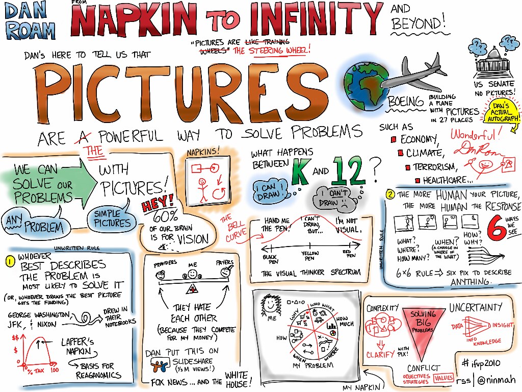
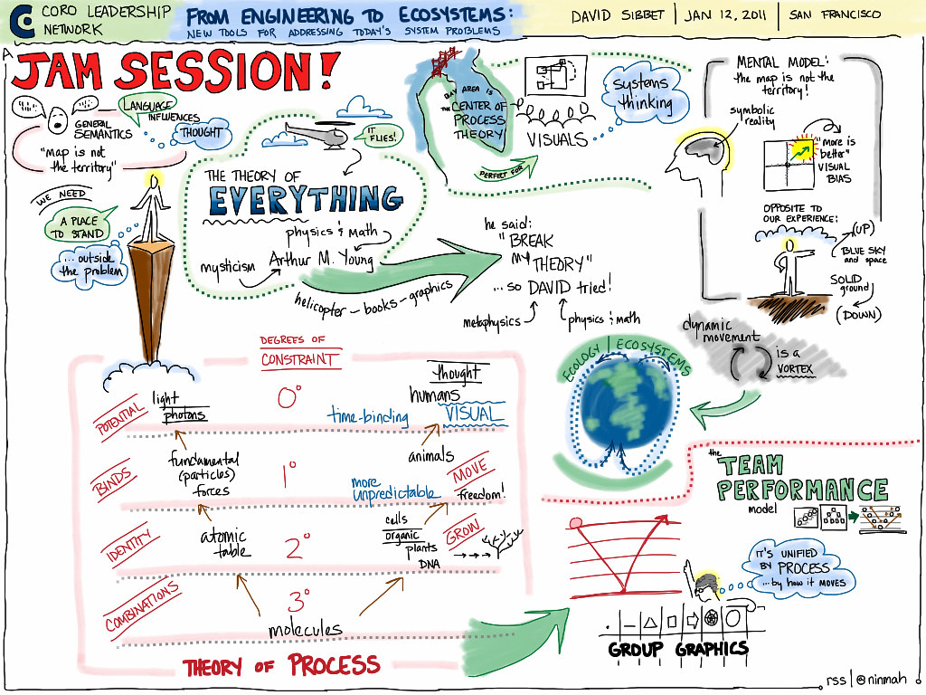
Looking for a way to track your progress as a graphic recorder and find out what areas to focus on for development? Try a chart critique. I recently printed out small copies of charts that I’ve recorded over the past six months — I picked one or two per month — and sat down with my colleague Laurie Durnell to go over them. We looked at how my style has been evolving, identified areas that are working well, and came up with a list of things to practice going forward.
I’d share the charts here, but unfortunately they are confidential to the clients I created them for. (The examples in this post were pulled from my iPad work on Flickr.) I can share some of the things I’d like to work on, though:
- Changing the length of the paper to help avoid blank space or crowding. I have been using 4′ x 8′ sheets, but I’m going to try 4′ x 6′ sheets, allowing one sheet per half hour, so that I can work on filling the space without crowding.
- Using different bullet styles (I tend to use all dots or all squares, varying only size and/or color) to indicate different levels or different lists.
- Differentiating the subtitles of the charts so they stand out more.
- Experimenting with really big circles!
- Creating a visual landscape on the charts — I don’t tend to do that unless I’ve planned it in advance. I aspire to being able to create this on the fly!
- Clarifying the visual flow of charts that aren’t straight-up lists.
(too much white space)
I find that I can pick one thing and practice it during a gig. For instance, if I have a two-day gig, I’ll pick “bullets” and then work on that with each chart I create during the meeting. Some things are best practiced in advance in my notebook; I don’t want my clients’ charts to look like practice work! But some things can be safely worked on during a real meeting, and that’s really how new skills get integrated into my practice.
(fun, but a little hard to follow)
It can be a little scary to invite someone to “critique” your work, but it can also be extremely helpful. Laurie was wonderful; she pointed out what was working, and her suggestions were both constructive and gentle. We noticed that having the charts be very small (printed on letter-sized paper) was an advantage because we could get a sense of the whole chart without being drawn into the content.
(ran out of room, though you can’t tell unless you were there)
Would you be interested in participating in a gentle group critique, or in a session on how to critique effectively? Would you be able to share your charts for such a purpose? What about paired critiques? Let me know — if there’s enough interest, I could do an online session about it.


2 responses to “chart critique”