I received a question today that many people have asked me: How do I make my lettering so neat and precise when I’m using drawing apps on the iPad? I’ve been asked if it’s a font, or if I use a special stylus or some other trick. Here’s my (perhaps disappointingly simple) answer.
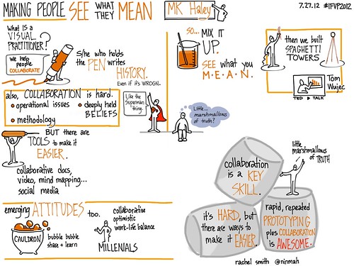
A recent piece. I’m still working on my lettering, by the way. Always.
I don’t use a stylus; I just use my finger. I zoom way way in so that I can only see a few words at a time, and then I scoot along as I write. The precise lettering is mostly due to practice — if you look at some of the earliest work I did, you’ll see that I’ve come a long way 🙂
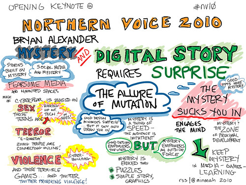
The very first iPad graphic recording I ever did – May 8, 2010. For reference, the iPad I was using (wifi + 3G) became available on April 30, 2010 — about a week earlier. I leapt right in.
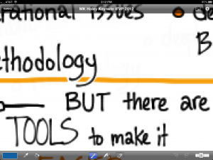
One trick I can share is to line up the baseline of whatever you’re writing so that it’s a little bit above the app border on the iPad. For instance, if you zoom way in, you can move the page around to put the words about half an inch above the bottom edge of the app, which of course is straight. Then use that as a guide while you write. In Brushes, you’d do this by using the two-finger-spread to zoom in, then use two fingers to move the page around until your text was just above the toolbar (or the bottom of the app if you’ve hidden the toolbar). Write a bit, use two fingers to move the page sideways, and continue.
Zooming in and lining up the baseline of text in Brushes.
That’s the main reason I don’t use a stylus, by the way — I’m always zooming and moving the screen, and if I had to hold a stylus while I did it, it would take way too long.
Happy zooming!


