Tag Archives: visualpractice

Red, Green, Blue: A Speedy Process for Sorting Brainstorm Ideas

Using a sticky note tool for brainstorming in remote meetings is a wonderful method to gather a lot of different ideas quickly. But once those ideas are up on the shared board, the task of sorting through them and choosing which options to pursue can be daunting. Here’s a method for tackling all that information and turning it into a manageable dataset, and a list of some of the pros and cons of doing it this way.

Step 1: Get the ideas out.

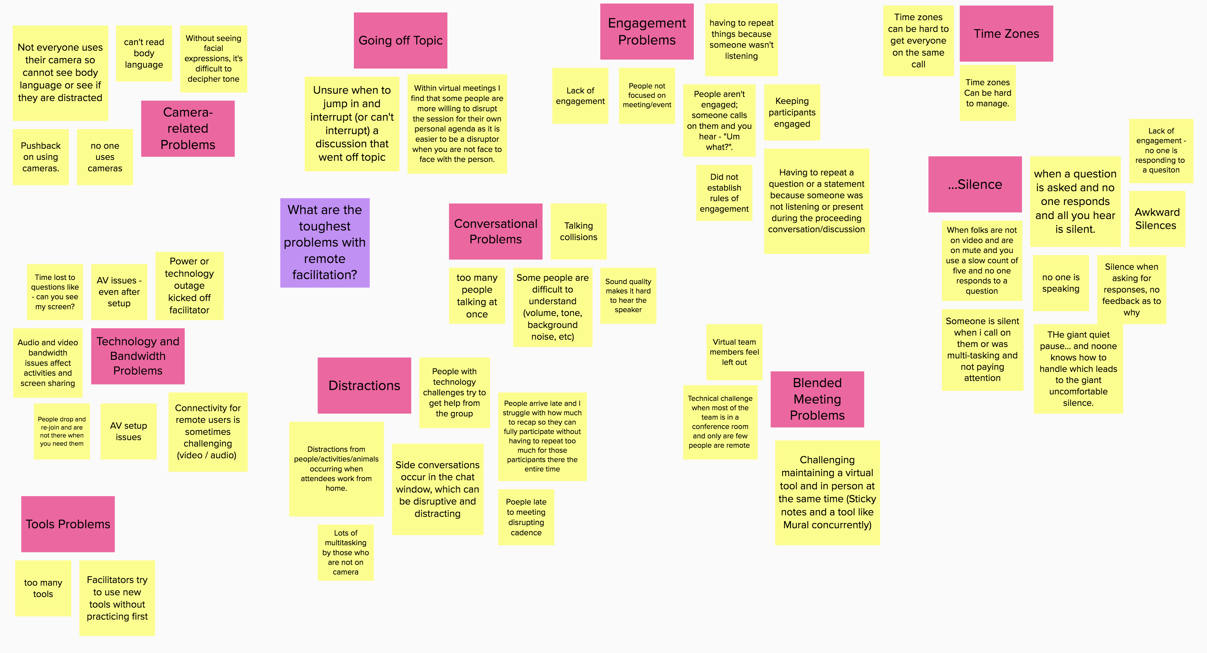
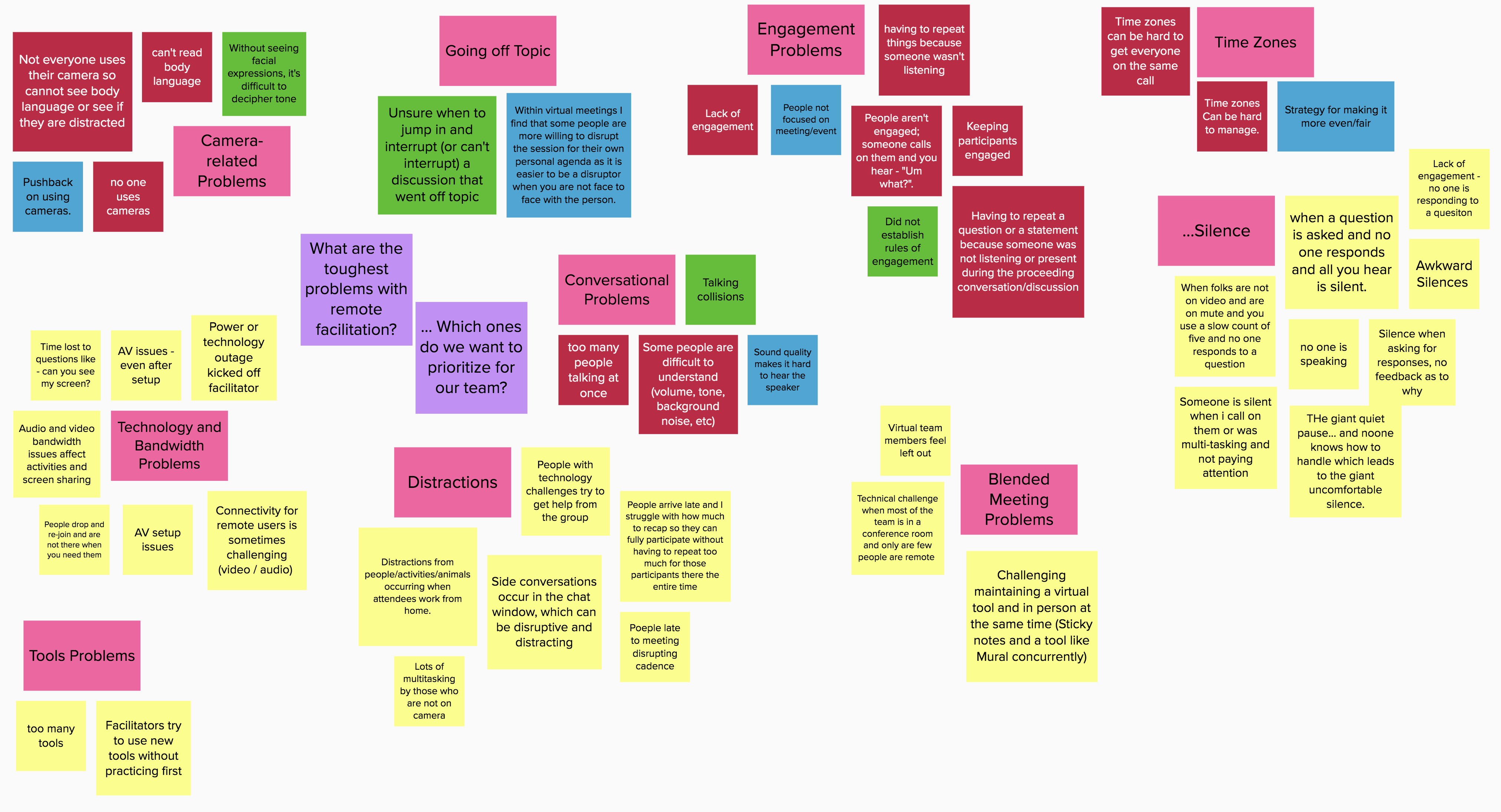
Gather your remote team and get them into the same sticky note board using whatever tool you prefer. (My example here was done in Mural.) Pose a good question and ask them to write one idea per sticky note. They can place ideas anywhere on the board. To make later steps easier, ask them all to use the same color note; yellow, for instance. Anything but red, green, or blue. (A nice feature of Mural is that it’s easy to turn a bunch of notes all the same color in one click, even after they’ve been created.)

A wall of words — fresh from the brainstorm! Click the images if you want to read the notes.

Step 2: Get the ideas organized. No judgment!

As a group, spend some time clustering the notes and removing or consolidating duplicates. At this stage, you’re just looking for things that are alike. You’re not evaluating anything. You can do this any way you like; if you have a high-energy group, ask them to silently cluster the notes all at the same time, and watch them fly around the board.

If your group is larger, or if you have some folks who are unfamiliar with the tool you’re using, silent clusters can be a little alarming and you might want to take a slower pass as a whole group, or assign sections of the board to breakout groups and then come together to finalize the clusters.

Make sure the clusters are clear and that all the notes in each cluster belong in that group. Naming each cluster as you go is helpful, too.

Sticky notes clustered into groups. The pink notes are the cluster labels.

Step 3: In, Out, or Discuss?

Make sure your guiding question is clear, and change it if you need to. The question must help participants decide whether ideas are in or out of scope. For example, in the fictitious brainstorm shown in my screenshots, the original question was, “What are the toughest problems with remote facilitation?” At this stage, though, I would need to amend the question to add, “… and which problems do we want to prioritize solving for our team?” There needs to be some reason for people to decide whether to keep or discard each idea, so make sure your question is pertinent. This second question makes the end goal clear: We are selecting priorities for action.

Now work through one cluster at a time. Set this up by saying something like, “We’re going to do a quick first pass on the ideas in each cluster. I’ll read out a note, and you tell me if it’s definitely IN, definitely OUT, or needs more discussion.”

Then further explain the labels:

In: An idea the group definitely wants to accept or adopt. It’s a no-brainer, a table-stakes item, something you’re already working on, or just plain required.

Out: An idea that doesn’t require any further consideration. It’s out of scope, technically impossible, too expensive (time or money), duplicates another idea already under consideration, or was meant as a joke.

More discussion: Anything else, including things that some people think are “in” and others think are “out.”

Work through each cluster note by note. If the group agrees unanimously that an idea is IN, turn the note green. If they agree unanimously that it’s OUT, turn it red. Otherwise, turn it blue.

As you read each note, people may only say “In,” “Green,” “Out,” “Red,” “Discuss,” or “Blue.” Again, if opinions on a given note are divided, it’s blue. Even if one person thinks something different from everyone else, turn it blue.

Work through all the clusters. When you’re done, all the notes should be either red, green, or blue.

Asynchronous or silent option: If this is too time-consuming or tedious-sounding for your group, you can use another method. Open up the board to voting, and ask each person to vote only on those ideas they think should be IN. If there’s a note that someone thinks should be discussed, they can turn it blue. If a note is OUT, leave it alone. Take a sweep through at the end. Any notes that have the same number of votes as people become green. Any notes that have no votes become red. Notes that are blue stay blue, and notes that have some votes but not the total possible number of votes also become blue. This can be done in between meetings to free up meeting time for discussion.

Note that some sticky note boards don’t have a vote option, and some have the option but don’t let you limit how many votes a person can put on a single idea. You have to invoke the honor system, but people usually play fair.

Working through each cluster. In this image, five clusters have been dealt with already, revealing four accepted ideas (green) and five ideas that need further discussion (blue). Notice that we’ve refined the guiding question here as well.

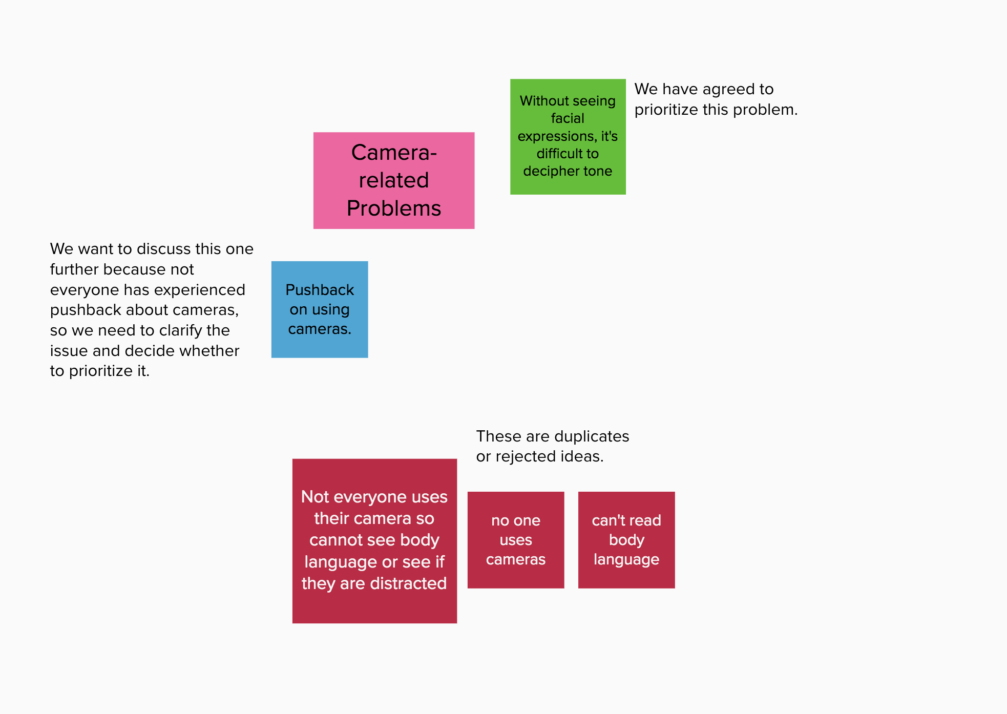
Step 4: Deal with the Blues.

The group can now ignore the red notes; they don’t matter. The green ones can float to the top or side (or leave them where they are) — they will move forward into the next phase, but you don’t need to talk about them now.

For each blue note:

Call the group’s attention to the note so they are all looking at the same thing. Ask, “What do we need to talk about here?” Facilitate the conversation, helping them work through the issues. At the end, the note should either be turned red or turned green. It’s perfectly okay to revise the note before changing the color, but it needs to be red or green at the end.

When you’re done, everything on the board should either be red or green (or a cluster name). Copy the green notes into a new workspace.

Talking about the blue ideas to get clarity and decide whether to make them red or green. The plain-text annotations are just for illustration here; I don’t write them on the sticky note board.

Step 5: Work with the Greens.

Working with the duplicated green notes, you can re-cluster (if needed — I usually don’t), dot vote, place the notes on a hi-low grid or a risk wall or something similar, or use the method(s) of your choice to decide which ideas to implement or adopt. Every idea has been considered, but no time has been wasted on ideas that don’t merit (or don’t need) discussion.

These are the green ideas from all of the original cluster groups, and this is one way to assess the relative value of the selected ideas. The ones in the lower right will yield the greatest impact for the least effort, in the group’s opinion.

Pros:

  • This method takes an overwhelming number of choices and turns it into a manageable number of choices pretty quickly.
  • As the group moves through the process, they feel a great sense of speed and progress rather than feeling bogged down or stuck.
  • It can bring in different voices, because people often have strong opinions about some of the notes and less strong opinions about others. They tend to speak up when they care about an idea.

Cons:

  • This can be a tough exercise for people who are color blind. See if your sticky note tool allows you to highlight notes in another way, such as changing the shape (star? stop sign? triangle?) or adding a sticker (check mark? X mark? question mark?).
  • Be careful about getting bogged down in conversation as you turn notes blue. Cut off blossoming discussions and let the group know you’ll get back to it once the notes are sorted out.
  • It’s possible for a vocal subset of the group to take over, causing others to check out. Manage this by asking for different voices to speak up, asking more vocal people to step back, or assigning a different champion to each cluster. Using the asynchronous or silent voting option can help combat this problem.

In-Room Adaptation

If you’re working with real sticky notes in a co-located meeting, you can still use this method. Grab markers in green, red, and blue. Add a big green checkmark to the “in” sticky notes. Make a big red “x” on the “out” sticky notes. Write a blue question mark on the “discuss” notes. Just make your marks in the edges of the notes, not over the words, so that people can read the original notes later. To change a blue note to a green or red one, cross out the question mark and add the appropriate green or red marking.

Cleaning Chart Photos with CamScanner

One of the participants in last month’s Advanced Visual Facilitation workshop pointed me to a new (to me) app for cleaning photos, CamScanner. I’m pretty happy with the way it cleans charts, and like many of you I’m having trouble with ScanScribe as my laptop advances technologically and poor ScanScribe does not.

CamScanner is an iOS app (there is also an Android version). It can open photos from your phone or iPad’s camera, or you can take photos with the app itself. Once you get a photo in there, you can correct the keystoning (straighten the edges), drop the gray out of the background paper, brighten the image, and transfer it to your laptop for final clean-up or editing. To my delight, I discovered that I could even do the transfer to my laptop even while sitting on a plane with no internet access.

You can also create an account with CamScanner to get cloud storage for your documents, but I didn’t. You can do everything described below without creating an account.

Here’s the original photo I was working with, taken on my iPhone:

Original chart photo

A teaching chart from the AVF workshop (original iPhone photo).


And here’s the way it came out of CamScanner after less than a minute of work:

Cleaned chart image

The same chart cleaned up in CamScanner.


Get a Photo Into the App
Launch the app and either use the camera button to take a photo (I haven’t tried this with a chart so I don’t know what the results are like), or use the import button (the smaller button) to grab one from your photo roll. You can open a few at a time.

CamScanner screenshot

Adding a photo to CamScanner


Correct the Keystoning
If you added a single image, the app takes you to the keystoning correction right away. Match up the circles with the corners and middles of your chart and click the checkmark to save.

CamScanner screenshot

Correcting the keystoning


If you added several images, it looks like the app does the keystoning for you. Tap one of the photos you imported to look at it more closely. If the auto-correction is not quite right just tap Re-Edit (top right) to do it yourself.

CamScanner screenshot

The Re-Edit button


Correct the Color
After you do the keystone correction, the app applies Magic Color almost as if reading your mind. That’s the one that drops out the gray paper background. You can check it against the original by tapping the Original button, or play with the other settings, but Magic Color usually does the job. Sliders at the bottom let you adjust the magic, the brightness, and the saturation. Click the check mark when you like what you see.

CamScanner screenshot

The Magic Color button


Wait… Was That an OCR Button?
Yes, yes it was. There are several languages you can choose from, but don’t get your hopes up. I haven’t found the OCR to do very much with my hand-drawn charts.

Put Them on Your Computer
Hidden behind the More button, the app has several ways to share your photos (email, text, upload to social media, connect with apps like Dropbox, Evernote, and others, and so on).

CamScanner screenshot

Sharing options


If you save them to your Camera Roll, you can use Air Drop to transfer them to your computer. I was utterly delighted to be able to do this on a plane, because I needed to clean one last chart to complete a project and Photoshop wasn’t cutting it. There was too much variation in the background. Since I had the photo on my phone already and plenty of time on my hands, I decided to give CamScanner a try. It did a great job, I saved it back to my phone, and then I used Air Drop to share the photo back to my laptop in about ten seconds.

Finish Up in Photoshop
CamScanner leaves a bit of garbage behind, but it was very easy to clean up compared to trying to do the whole chart in Photoshop.

And there you go! I definitely recommend it for speeding up your chart cleaning if you’ve lost ScanScribe.

What else have you found to quickly clean charts? I’d love to explore more options.

Two new resources for better visual meetings

Cover of the book on gallery walks

The Gallery Walks book

My colleague and friend Lisa Arora of Get the Picture recently published two digital books about important topics in graphic recording — how to really make the most of the dance between a facilitator and a graphic recorder, and how to conduct gallery walks of completed charts — and they are outstanding.

How To Get the Most Out of Working with a Graphic Recorder is an excellent resource for facilitators and graphic recorders (GRs) about how to work together. The suggestions and explanations are clear and insightful, and if you implement them I guarantee they will make your very next tandem engagement better. I highly recommend it for anyone running a meeting or workshop who plans to work with a GR, even if you don’t think of yourself as a facilitator. If you’re wondering whether you want to hire a graphic recorder and have never engaged one before, read this book to understand how to work with one so that you reap the real value of working visually. If you tend to work solo (doing both the facilitation and recording yourself), you might pick up a few tips, but the book is really aimed at facilitator-graphic recorder partners, and for those who plan to engage one or the other.

The other book, The How To on Effective Gallery Walks for Visual Meetings, is comprehensive, creative, and brilliant. It really gets into gallery walks (where participants spend reflective time looking at the maps at different points in the meeting, and thinking deeply about them). It goes way beyond grouping people up and having them file past the charts. If you want to extend the life of the maps, maximize their usefulness to participants, and deepen the level of thinking in the group, get this book, read it, and build a real gallery walk into your next visual meeting. I’ll be pulling ideas out of this one starting immediately, I can tell you.

Go take a look at the two books. If you partner or hire facilitator/GR partners, get them both. If you are a graphic recorder, a facilitator, or a dual-role graphic facilitator, or if you plan, host, or sponsor visual meetings, get the one on gallery walks. You’ll be glad you did.

GR101 is going to Berlin!

Interested in learning how to be a graphic recorder? Planning to be in Berlin in July? Have I got some news for you!

The fabulous Lisa Arora (of Get The Picture) and I will once again be co-leading the IFVP’s signature training, Graphic Recording 101 (or GR101). It will be held on July 22, 2014, in the awesome Hotel nhow. The workshop is scheduled as a pre-conference session in conjunction with EuViz, a brand-new conference hosted by Kommunikationslotsen and Neuland and co-hosted by IFVP. Already, EuViz promises to be something very special. The conference itself is sold out, but the pre-conference isn’t, and you don’t need to attend EuViz to attend GR101.

You can learn more about GR101 and register for it on the EuViz pre-con page. Not sure yet? Here’s the promo video for the workshop:


Sketchnoting Blogs

sticky note that says Sketchnote ResourcesI’ve finally gotten around to rebuilding my feed reader (my previous reader collapsed under its own weight from the astonishing number of unread posts). I’m being rather more selective this time around. Here are a handful of blogs that I’ve added on the topic of sketchnoting:

Rohdesign and The Sketchnote Handbook 
Mike Rohde

Mike Rohde’s book, The Sketchnote Handbook, has helped pave the way for new sketchnoters. (Plus, Mike invented the term ‘sketchnotes.’) He also has a blog, some cool t shirts, and a forthcoming workbook to go along with The Sketchnote Handbook. Highly recommended. Check the blog for a series of videos about producing the workbook.

Verbal to Visual
Doug Neill

Doug Neill’s mission is to teach sketchnoting skills broadly, so people can apply it to whatever they are working on. Find sketchnoting tips on the Verbal to Visual blog and listen to Doug’s podcast series featuring visual thinkers. Doug is also working on a book on building your sketchnoting skills.

Sketchnote Army
Binaebi Akah, Mauro Toselli, and Mike Rohde

Started by Mike Rohde, Sketchnote Army is a showcase of sketchnotes from around the world. You can submit your own notes to be featured on the site, or just browse for inspiration.

Sketchnotesbook
Eva-Lotta Lamm

Eva-Lotta travels to conferences, takes sketchnotes, and publishes them in yearly books. She also teaches and gives talks about sketchnoting.

Not an exhaustive list by any means, but I’m easing in gently. Which sketchnoting blogs would you add?

Annotating Sketchnotes with Voicemap

Update, Feb. 2020: Voicemap is no longer available.

I’ve been playing with Voicemap, an online tool for adding audio and zooming points of interest to an image (like sketchnotes or a graphic recording). It hasn’t been easy. The instructions on the site aren’t very clear, and a lot of mistakes can’t be fixed without starting over. But I have finally completed my proof-of-concept Voicemap: An annotated review of visual notes I took during Doug Thomas’ TEDxUFM talk, “A New Culture of Learning” (link goes to the actual TEDxUFM talk).

(Voicemap no longer available)

Voicemap of my visual summary of “A New Culture of Learning” by Doug Thomas

Reflections

I really like Voicemap for the way it pairs audio with visual notes. Seems like it would be a great way to create a summary after a meeting: Upload the notes, then walk through them with a narration of the meeting’s highlights. Unlike the RSAnimate-style sketch movies, you don’t see the drawings being created in a Voicemap video — it starts with the image already finished — so it’s great for graphic recordings created during an event.

There are a few drawbacks. It looks like you have to publish the piece on Voicemap’s website, which means I can’t use it for many of my clients (too public). The format is better suited for pre-planned visual notes, or notes that are created after hearing the audio, so that you can walk through the image in a logical way. You’ll notice that I skipped around the page, following the flow of the talk rather than the visual structure on the page. That’s because I skipped around the page while creating the notes. Voicemap works better if you have a cleaner visual path to follow.

The most annoying thing is that the aspect ratio of the video when you edit it is different from the one you see when you view it (the editing one is 4×3, but the published one is closer to letterbox). The default embed code is also weird: it gives you a 640 x 640 viewer, which means your careful centering is shifted and everything is cut off on the right, with too much space on the left. The viewer above is actually cut off on the right side. If you want to see it more or less as it was meant to be viewed, try it on the Voicemap site.

Update: Voicemap contacted me and pointed out that I can change the width measurement to 640, which I did. This fixed the embedded display issue. To be fair, I did try that. I just changed it in the wrong place. Doh.

How You Do It

First, you start a project by entering some information about it (title, abstract, script, and so on). You can upload an audio file at this point also, although I had a great deal of trouble with that step. I tried several different formats (WAV, AIFF, MP3) and two different lengths (2:56 and 3:41). Eventually, the audio did load, but it took days in one case, and four or five upload attempts in another.

Once you get past that step, you can add a sketchnote image and set zoom points (points of interest, POI) that are timed to the audio track. You do this by listening to the track, pausing when you want to set a POI, then setting it and continuing. It really helps to have uploaded the script before you do this so that you can scroll through the script while you listen. When I did it that way, I found I could time the POI swaps better.

When everything is to your liking, you click Publish. From what I saw, publishing happens instantly.

Other Uses of Voicemap

It looks like graphic recorders can sign up with Voicemap, take a test, and become certified to do sketchnotes for audio clips that Voicemap sends them. Voicemap clients, then, can send in a script or audio clip and request a corresponding sketchnote video. The graphic recorders don’t get paid very much, but if you have an iPad or tablet, it looks like you could pick up a couple extra bucks illustrating Voicemap clips. I’m not sure how busy the service is yet.

Graphic recording of web meetings with the iPad – Yes, you can!

“So can I graphically record a web meeting on my iPad?”

That’s a question I get asked a lot, and historically, it has had a complicated answer. For a while, the answer was “Not if you want anyone in the web meeting to see your graphic recording while you’re doing it, no.” Then it was, “Yes, but only if they’re on the same wireless network you’re on, and even then it’s a lot of setup.” After that it was, “Technically, yes, but realistically, no,” because although it was technically possible to share your iPad’s screen to a desktop and then share the desktop’s screen in a web meeting, it wasn’t easy, smooth, fast, or reliable. As of last week, the answer has changed again.

That’s because last week, Squirrels released Slingshot, the first really workable solution that I’ve seen for real-time graphic recording in a web meeting using an iPad. Is it perfect? Nope. Is it good enough? Yes, for some situations. Is it for everybody? Nope.

Screenshot of iPad

My quick iPad drawing (screen shot from iPad).
I’m zoomed in a little, which is why it looks a bit fuzzy.

How Does It Work?

Slingshot lets you host a web conference in a snap from your desktop computer or mobile device. If you’re hosting from your desktop, you can use Airplay (built into your iOS mobile device) to mirror your device’s screen to your computer, where it is automagically screen-shared with everyone in the web meeting. Once I had downloaded and installed Slingshot on my computer, it took about five minutes to launch a meeting, connect my iPad, and share my iPad’s screen with someone in the web conference. I launched a drawing app on the iPad (Brushes in this case) and started drawing, just as I would if I were taking notes. My remote-viewing partner in crime (in this case my partner in many other things, Craig Smith) reported that the drawing was very smooth, no delay, no jumping around.

Squirrels also makes an app called Reflector, which mirrors your iPad screen to the desktop just like Slingshot. With Reflector, you have to join a web conference with something like Skype, WebEx, Connect, or Join.Me, and then share your screen. Slingshot skips all that by blending Reflector’s mirroring capability with an easy-to-use web conferencing tool, so you only have one thing to set up.

Photo of computer and iPad showing Slingshot

The iPad, where I was drawing, mirroring into Slingshot.
You’re seeing the Slingshot app floating over the Slingshot web page.
Don’t worry that the iPad is plugged in; it doesn’t need to be. I was just running out of juice.

Sounds Great! So Why Isn’t It Perfect?

First, because of how the mirroring works. Not only does your drawing get mirrored, but everything on your screen gets mirrored too — the palettes, title bar, whatever you can see. But we could live with that. The thing that really gets in the way is that the zooming gets mirrored as well.

To get good results and fit a lot of stuff on one screen, you need to zoom in when graphic recording on the iPad. Which is fine, except that when someone else is watching the screen and sees the zooming without any context, it’s very disorienting. I would be very careful about using this to record a web conference just because of the mirrored zoom. I wish there were a way to turn that off and just show the graphic recording unfolding without the zooming. That would be pretty darn close to perfect.

Second, you can’t do it just from the iPad, without the desktop computer. You still need to join the meeting on a desktop computer running Slingshot, and then you connect the iPad in order to mirror it. I really wanted to be able to join the meeting on the iPad and share the screen from there, but that’s not how it works.

The third reason isn’t particular to Slingshot. It’s just that live graphic recording on the iPad is not for everyone, regardless of how it’s shared in the web meeting. It’s slower than recording on paper and it requires more concentration, which means you can miss things. It’s much easier to get sucked into what you’re doing and forget to listen, especially if you’re not completely familiar with the drawing app.

Last but not least, both times I set up iPad sharing, Slingshot on my desktop crashed as I connected the iPad the first time. Once I relaunched and reconnected the iPad, all was well.

However, at long last, when someone asks if it’s possible to use their iPad to record a web meeting, I can say, “Yes! Yes it is.” Thanks, Squirrels!

Creating sketchnote joy with Inkflow by @Qrayon

Qrayon does it again! You may remember Air Sketch (which is still super awesome, by the way), the app that lets you wirelessly broadcast your iPad drawing to other devices on the same network while you draw it. This week, I happened upon another tool by Qrayon: Inkflow.

I am in love. Inkflow is a wonderful tool to blend digital and paper sketchnoting. You can use the app itself to take notes and organize them into books. You can also add typed text, images, and photos of notes you have taken on paper — which then become objects on the Inkflow page that you can move and scale with no loss of quality. Look at me, I’m so excited I’m jumping all over the place! Let’s get organized here and look at how Inkflow is for sketchnoting, the vector/bitmap comparison, a few key features, a list of what’s missing from my point of view, and whether or not I’d recommend it as a visual notetaking tool.

Sketchnoting in Inkflow

Writing and drawing in Inkflow is a beautiful thing. The flow is smooth, there’s no lag, and the canvas is large. Since I’ve only just begun to play with it, I’m using it as though it were Brushes, which is causing me some angst. But I can see that with a little practice I’ll get used to the way it works and do much nicer work. To test it out, I did a little visual notetaking while listening to the TED talk How Great Leaders Inspire Action by Simon Sinek.

Sketchnotes of Simon Sinek's TalkMy visual notes of “How Great Leaders Inspire Action” by Simon Sinek.
Click for a larger view.

Don’t let the non-white background alarm you; you can choose different styles. I just used the default for this one. You can actually change it after the fact, which rocks, and there’s a plain blank white one. It has a palm blocker too, so if you prefer a stylus you can pull up the palm guard to cover the bottom part of the screen.

One thing to note: A lot of the features I’m describing are only available in the paid version, which at the time of this writing costs $7.99. Definitely worth it.

Vector vs Bitmap

Inkflow is a vector drawing tool, which means that what you draw is stored as resizable objects. However, it behaves a little like a bitmap drawing tool (like Sketchbook Pro), which means that it feels like you’re painting with a brush. The lines are smoother and more even than I’m used to, and I can’t quite get the same variable quality of line that I love in Brushes (which is also a vector tool with a brushlike feel). The trail-off at the end of a stroke is different, too, which makes my lettering look a bit sloppy to my (self-critical) eye.

However, one of the coolest features of the vector-based Inkflow is that you can select, move, and resize parts of your drawing (or the whole thing). You can enlarge small things and they won’t get fuzzy, or shrink big things and they won’t get muddy. Oh, and if you need to rearrange your notes as you go, you can! File the selection tool under A for Awesome.

Adding Text or Photos

If you don’t feel like writing, you can type instead, and then draw or write alongside the typed text. You can also drop in photos or illustrations alongside your work, or annotate them. The stationery feature lets you pull in images to use as custom backgrounds (did someone say templates?).

Adding Paper Notes

I love this part. I have a bunch of notes I took on copy paper (you know, analog) for different meetings for whatever reason. I’ve been carrying them around in a folder and trying to decide what to do with them — I’m in an awkward place between using a paper notebook or my iPad at work, so I have notes in both places. Yuck.

With Inkflow (the paid version), you can take a photo of your paper notes and they get pulled into your Inkflow notebook. They become a vector image, so you can resize them up or down, move them around, select part of them, erase the little smudges around the edges… it’s totally cool. Now I have a work notebook that includes my loose notes, plus I can add as many pages as I need to for notes during meetings. Whoa.

What’s Missing?

The things that are keeping Inkflow from being absolutely perfect for my needs (I know, like it’s all about me, right?) are, in order of importance:

  • A lack of layers. This is the biggie, because I want to be able to draw outlines and color them in later, with the color underneath the outline. I also want to be able to experiment with stuff and get rid of it easily if it doesn’t work out. Update: Qrayon says they are working on a ‘draw-under highlighter’ that might help with this. Yay!
  • No quick way to zoom out to 100%. This was pretty frustrating while I was recording the sample. I do a lot of quick zoom outs to check size and placement of elements, and it’s annoying to have to do the pinch thing several times to make sure I’m looking at the right view.
  • Limited sizes and shapes of the brushes. Three brush shapes plus an eraser is actually okay; I can live without the airbrush. But the settings for tip size aren’t fine-grained enough for me. For instance, on the paintbrush, you can pick 24, 32, 48, 64… you get the idea. Nothing in between. I also miss being able to easily draw a dotted line. I use that a lot.
  • A limited active color palette. This is annoying, but it isn’t a show stopper. You have access to lots of colors, you just can only pick eight of them to use without mixing at any one time. Update: Qrayon responded to let me know that you can swipe the palette sideways for more colors, which I hadn’t realized. Definitely helps with setting up colorsets.
  • Zoom only goes to 12%. This bothered me a lot at first and then less as I learned to work with the app. I wanted to zoom in further, but I found that if I just worked at a slightly larger scale it was actually okay. I still would like a little more zoom action for that extra precision I like in my lettering. I love that the screen stays at full resolution even when I’m zooming.

So, Overall?

Overall, I love Inkflow and I’m looking forward to using it to take notes in my next meeting. It effectively combines several of my favorite features from other sketchnoting apps, it’s easy to use, and I love that it’s vector-based so I can move stuff around. Easily 4 out of 5 stars, and adding layers would kick it up to a 5. If you’re looking for a notetaking tool that’s simple but versatile, I can recommend it.

Updated 5-3-2014 with some news about color palettes and an upcoming draw-under tool.

What’s with all the words?

The other title I considered for this post is Only You Attend the Meeting in Your Head. This is about two related questions that I get from time to time. From prospective clients or people who are curious about visual practice, I hear: “How do you decide how to balance text and images in your work?” From fellow practitioners, I hear: “My client asked me to record using only pictures. Got any advice?” Advice? Maybe. Opinions? Always. Read on. 

Graphic recorders, as you know, capture a presentation or a discussion in a visual way. To me, “a visual way” implies a few different things:

  • The people having the discussion, or listening to the presentation, can see what is being captured. (Otherwise, I call it “visual notetaking” and not “graphic recording,” but YMMV.)

David records

David Sibbet recording reflections at IFVP 2008. The whole group can glance over and see the chart as he creates it.
  • The graphic recorder organizes the information on the page or screen while she is recording it. The completed map is clear and easy to navigate. The information is presented in an engaging and maybe a beautiful way.*
  • For a discussion, this means that related ideas are grouped or linked visually, even if they are expressed at very different times in the conversation. Important or repeated ideas are highlighted somehow. Group agreements are clearly indicated. In other words, the graphic recorder helps organize and annotate the group’s thinking. At Elliott Masie’s Learning 2013, where I remotely captured a series of plenary interview sessions this week, this was described as ‘curating,’ a term I like.
Color, shading, and placement indicates related concepts. Remotely digitally recorded for Elliott Masie’s Learning 2013.
  • For a presentation, the speaker’s key points are captured, usually in the sequence they are presented. This is because someone — the presenter — has already curated the subject matter. (One hopes.)
  • Some key points, important concepts, evocative moments, or relationships between ideas are annotated or captured with images as well as, or instead of, words.
Avril Orloff blending words and images (beautifully) to capture a presentation at IFVP 2010 in Redwood City, California.

Notice that the pictures part of ‘visual’ is way down in that list. I did that on purpose because in my practice, I emphasize the first and second bullets.

Every now and then, when I’m scoping a project with a client, she will say something like this: “… and I want you to capture everything with pictures. I don’t want a lot of words, just pictures.”

So here’s the thing with that.

The first rule of graphic recording (as I practice it) is this: Capture the speaker’s exact words. There are two reasons to do this. One is that the speaker will only understand he has been heard when he sees his own words written down on your chart. The second reason is that there are always two meetings going on: the one in the room, and the one in your head. The only experience that you can guarantee everyone is having is the one that is happening there in the room. The only person attending the meeting in your head is you. (Honest.) If you change the speaker’s words, even if you are interpreting or paraphrasing, you are recording the meeting in your head, which no one but you is attending.

If you use only pictures to capture the discussion, you are interpreting everything. Pictures can enhance understanding only if the context is clear. Without the shared context of the words, the meaning is apt to be lost, and when participants review the charts after the meeting they will not recall as much as they would if you had also captured some of the exact words they heard in the room. There are very, very few universally recognized images, and they generally communicate very simple concepts — not the complex ideas and relationships between them that are the substance of a facilitated working session or a really good presentation.

When a client asks me to record using only images, I try to get a little more information about what they want to do with the finished work — what their outcomes are. If they want the piece to remind people of the conversation and be a resource for future discussion, it’s critical for the words people actually heard to show up in the chart. If they are looking for a commemorative mural to frame and hang as a work of art, I happily direct them to other practitioners who will give them something much more in line with what they are after. It’s not wrong to want that as an outcome. I’m just not the best person to deliver it.

There are many, many flavors of visual practice, and many applications for the different approaches. Just like any other method or tool, some applications are a better fit with some approaches than with others. Match your tools and methods to your outcomes, and you’re golden.

* If I’m doing graphic facilitation — working directly with the group as opposed to working only with the chart while another facilitator handles the process and group dynamics — my charts are often not, strictly speaking, beautiful. I’m okay with this. The information is there, and it’s organized, and people can read it. When I’m doing straight graphic recording, I go in for beauty a bit more. I also know some wonderful practitioners who achieve beauty at very high levels no matter what their role.

Two Apps to Watch: bContext and Underlay Stripper

Well, one app, and one tool that makes another app work better:

bContext

bContext is an iPad app that lets you record drawings and annotate them with audio. Thanks to some embedded editing tools, you can import images and draw over them, record yourself talking about what you are drawing, and create a video of the whole process. The drawing tools are not quite ready for the kind of detailed work I tend to do on my iPad — yet — but I have high hopes that they will be.

I had the pleasure of meeting bContext’s co-founders, CEO Massimo Scapini and CTO Felipe Saint-Jean, a couple of weeks ago when they were in town for TechCrunch’s Disrupt SF 2012 conference, and they gave me a tour of some of the new features that are coming up. I also got to put a in good word for some of my favorite wishlist features. This is definitely an app to keep your eye on!

Underlay Stripper

Underlay Stripper is a tool created by Altuit that runs on the computer (it’s not an iPad app) and works with the Brushes iPad app. I don’t believe it has been released yet, but I was able to beta test it and I am hooked. It lets you remove a layer from a Brushes drawing so that it doesn’t appear in the final image and video. This may not sound like a lot, but if you do iPad movies with Brushes, it’s huge: you can drop your sketch into the bottom layer, draw the movie on top of it, and then strip the sketch out so it doesn’t show in the final video. Fabulous!

I’ve used the beta extensively, and it’s reliable and simple to use. Keep your eye open for the official release — it’s a tool worth having.