On June 3, 2015, I sat around a virtual campfire with Steve Cady, Rebecca Bruns, John Spalding, and about 50 guests, and we talked about graphic facilitation as an art and as an experience. I was honored to be invited to think of myself as a warrior and an artist. The chat lasted a little over an hour and you can watch and listen to it here:
What I loved about this was the way Steve pulled in images from all around the web to prompt the discussion topics. I had a list of advance questions that I responded to, but the chat itself wandered in and out and around that list, so it was totally unscripted. It was a fun conversation, covering a range of topics, including the nature of virtual campfires, the New Media Consortium’s Horizon Report, graphic facilitation and technology, my personal mission on earth, interpretation and reflection in visual practice, and the emotional aspects of taking visual notes.
I admit I’ve been waiting for this app to be released ever since I first saw it demonstrated at EuViz 2014 by its creator, Holger Nils Pohl. I fell in love with the demo and instantly became BFFs with Holger (at least on my side). When the beta version was ready, I happily tested that, although I had to use a colleague’s iPad to do it. Now I’m thrilled to have the WorkVisual app on my own iPad and to have played with it enough to write up a review. (A long one.)
Lest you think that I am regarding this app through rose-tinted glasses, let me say right up front that it isn’t perfect. Read on to find out what I love, what I don’t love, and why despite its rough edges, this app is worth the $40 sticker price to me. But first, a video I created with the app yesterday:
See below for some notes about the video.
WHAT’S WORKVISUAL?
WorkVisual is a drawing app designed by a graphic recorder for graphic recorders. It’s optimized for digital note-taking, sketchnoting, and graphic recording. It isn’t a mind-mapping tool or a drafting tool. It’s designed for people who write and draw everything by hand. For those of us who know and love the original Brushes app, this is the first app that even comes close to reproducing the features and line quality of Brushes. Because it was designed by a graphic recorder, it adds some important features that even Brushes didn’t have.
WHAT I LOVE
In no particular order, these are the features that make me giddy with delight:
Presentation modes: WorkVisual has two modes for projecting the screen, Full and Follow. Set it to Full, and the projector keeps your work at 100%, showing the entire screen no matter how much you pan and zoom on the iPad itself—perfect for digital graphic recording in front of an audience. Set it to Follow, and viewers see what you see—perfect for teaching.
Gallery tags: I create a lot of drawings. WorkVisual has a tagging feature so that I can add the subject, client name, location, event name, or other labels to a drawing. Later, I can search on that tag to pull up all the related drawings.
Four spots for brushes: Access three custom brushes and an eraser with one single tap. This means a lot less fussing around in the brush menu.
Clean interface: The UI is incredibly simple and light. I had actually done two different graphic recordings before I realized that there’s no way to dismiss it. I simply stopped noticing it was there, except that all of my tools were always available.
Transparency lock: I love this, just love it. You lock the transparency of a layer, and then you can color over places you’ve already drawn, but nowhere else. Great for fixing mistakes where you wrote or drew in the wrong color accidentally.
Layer access: Switch to any layer with one tap. I switch layers a LOT and this makes my work so much faster.
Set as default: This hidden feature is super handy. In the Gallery, you can choose a drawing to set as the default, which means that any new drawing will start with that as the base. Great for setting up the titles and basic frames for a series of graphic recordings at an event.
Brush presets: Get your brushes just the way you want them and save a preset. Then, modify them for a custom job and save a different preset. Switch between them with a couple swift taps. Awesome.
And there are the features that are must-haves for graphic recording, for me at least:
Zoom: zoom way in, and double-tap to zoom out instantly. I use this all the time. Because the zoom is a double-tap and not a single one, you can tap-to-dot for punctuation, lettering, and so on.
Layers: Up to six, which is enough for me. They have the standard features of merge, transform, normal & multiply modes, opacity, duplicate, add a photo, clear, fill, and hide.
Undo: Just like the original Brushes, if you undo something, it won’t show up in your movie. Yay!
Export options: From the Gallery, you can mail a drawing as an image, save it to your Photos, or export the image sequence for the WorkVisual Exporter Mac tool (alpha).
Brush options: The brushes are customizable to just the right amount—enough flexibility to be useful without being confusing.
Color palettes: Create up to five swatch palettes of 15 colors each, plus you always have access to a custom color picker.
Eyedropper: Tap and hold anywhere to pick up that color, just like the old Brushes — yay!
WHAT I DON’T LOVE
Of course, there are a few things that aren’t ideal. Some of these might be bugs, and some are purely my preferences. I’ve shared the ones I think are bugs with the app’s creator, who is super and very open to feedback (thanks, Holger!). Again in no particular order:
Double-tap to zoom: This is a plus and a minus. It’s a plus because, as noted above, I can dot my i’s and punctuate properly. But I find that most of the time, the app reads my double tap as a single short stroke. The workflow looks like this: double-tap, double-tap, double-tap, double-tap, zoom, undo, undo, undo. I imagine for someone using a stylus, this would be difficult too.
Current brush shape doesn’t highlight: When editing a brush, it would be nice to know which brush shape was currently selected without having to look down at the brush button.
Brush sizes reset in between choices: If you set up a custom brush and change its pixel size, then use that same button to select a different brush temporarily, when you go back to the first brush it will have reset to the default pixel size. Creating and loading presets doesn’t help. This gets in my way because I have six common brushes and there are only four brush buttons, so I have to change to the other two when I need them. My basic brush keeps resetting from 3 pixels to 30. (Then again, maybe the app is just trying to tell me I write too damn small.)
‘Undo brush’ notification: Every time you tap Undo, which for me is often, a little box pops up to let you know the brush is being undone. I have to wait for it to vanish before continuing. It doesn’t stay up long, but it breaks my flow and I would love to be able to turn it off.
Layer order in Export tool: There’s a bug (I assume) in the exporter tool that reorders layers when you export a high-res image or video. Since I usually create the text & outline layer first, then create the color layer when I need it and drag it underneath the first layer, this means that in the exported video my color is on top of my outline, which looks bad. You can see it in the video if you look closely enough.
WHY IT’S WORTH THE STICKER PRICE
At the time of this posting, WorkVisual sells for a pricey $39.99. I hear you. “For an app?! Are you nuts?” I know, I know. Here’s the thing. I’m a professional digital graphic recorder. This is a professional tool. It’s worth the investment. If your work involves drawing, sketch noting, or graphic recording with the iPad, this is the next tool you want in your toolbox. One job will cover it, you know it will.
When people ask me which app I recommend for graphic recording on the iPad, this is the one I will tell them to get if they are serious about it.
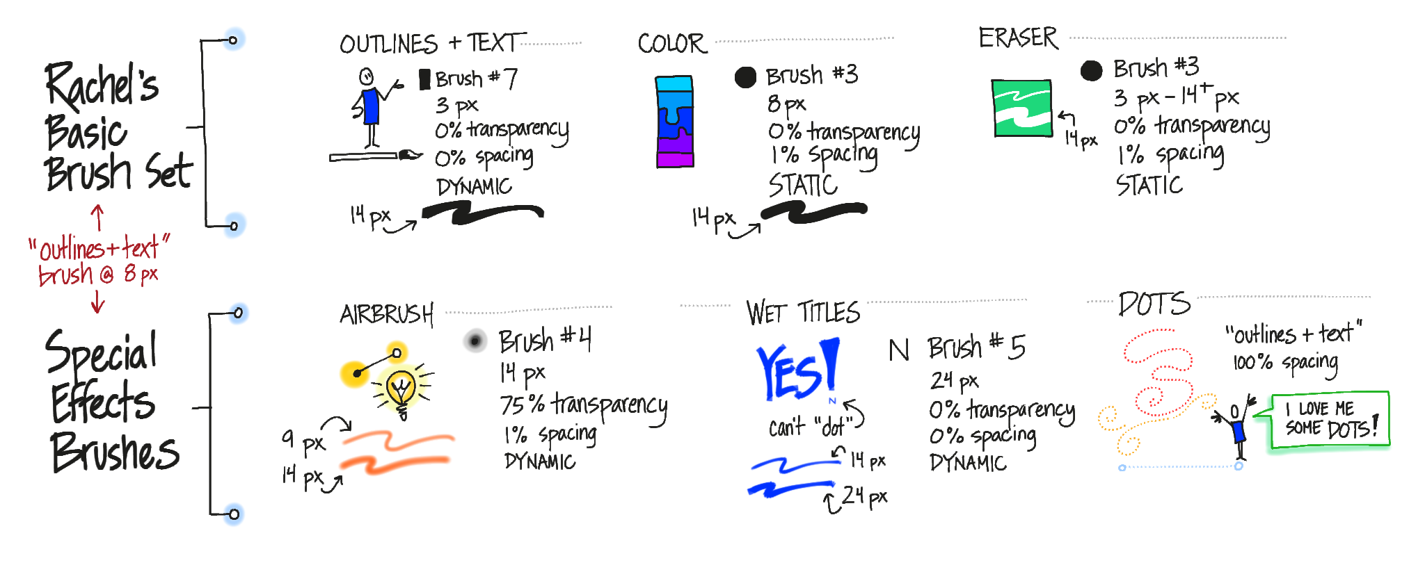
MY BRUSH CHOICES
It’s all explained in the video, but here’s a reference for my initial brush setup (click it for a readable copy):
I think I’ll change the basic brush from 3 pixels to 5 pixels, because there’s a lot more variability in the line at 5 pixels. Plus, it really wouldn’t hurt if I wrote a little bigger. That will probably mean I bump the Color and Eraser brushes up a couple of pixels too.
MY TOOLBAR SETUP
This is how I have my brushes set up, and how I arrange the layers as I create them:
It’s a screen shot right out of the app, and all the lettering was done in WorkVisual. That’s its actual toolbar.
MAKING THE VIDEO
I’ll post a detailed step-by-step in a week or so once I’ve gotten the process smoothed out. For now, the short version is that it is possible but you’ve really gotta want it. Here’s a high-level overview:
Create your drawing. There’s a bug in how the layers are rendered out, so it’s best to set up your layers before you start and don’t drag any layers underneath any others.
In the Gallery, use the Export for Mac Tool command to email the .workvisual file to yourself.
Open the .workvisual file in the WorkVisual Exporter (separate Mac application).
Export it as described in the instructions on the app website.
Use your favorite tool to convert image sequences to video (there is a WORLD of sub-steps hidden in this one). I haven’t successfully rendered a high-res video from the app yet.
Open the video in your favorite video editor, add a voiceover and soundtrack, and render it out. Ta da!
You can see the result above. Couple things to look for in the video:
Since I couldn’t render a high-res one, it’s tiny (540p). If I render it larger (740p or 1080p) the lines are very blurry and look bad.
That, combined with my tiny writing, makes it difficult to read the text.
I made a couple of mistakes and erased them, so you’ll see that happening. Other mistakes I used the ‘undo’ command to get rid of, and you won’t see those.
The layering bug means that everything I color shows up on top of the outlines in the video. It looked right when I was recording it, but because I had reordered the layers, it comes out wrong in the exported video. It’s correct in the final still image of the video, which is a screen shot of the app.
THE BOTTOM LINE
I’ll say it again: When people ask me which app I recommend for graphic recording on the iPad, this is the one I will tell them to get if they are serious about it.
I am thoroughly delighted with the app and ready to start using it as my primary digital note-taking tool. The initial release is a solid, robust app that does what it says it will do, with a clean interface and just enough features for graphic recording. I’m confident that it will continue to evolve and develop.
Because the Export tool is still in alpha, I’m not quite ready to kill Brushes in favor of WorkVisual, but I can see that happening down the road. This is good because my poor iPad is existing in a state of unstable limbo with iOS 7. I can’t upgrade to iOS 8, or I’ll lose Brushes’ ability to export high-res images and video completely. At the moment, Brushes is still the better option for creating video in terms of workflow and output.
With a little more work on the alpha Exporter tool, WorkVisual will soon be the app that I use most out of all the ones on my iPad.
Updated to add a mention of the Eyedropper feature that got left out the first time.
Today everything aligned perfectly — time, equipment, and perseverance — and I was able to test the new Work Visual app by Holger Nils Pohl. I am SO excited! These are some initial notes about my experience.
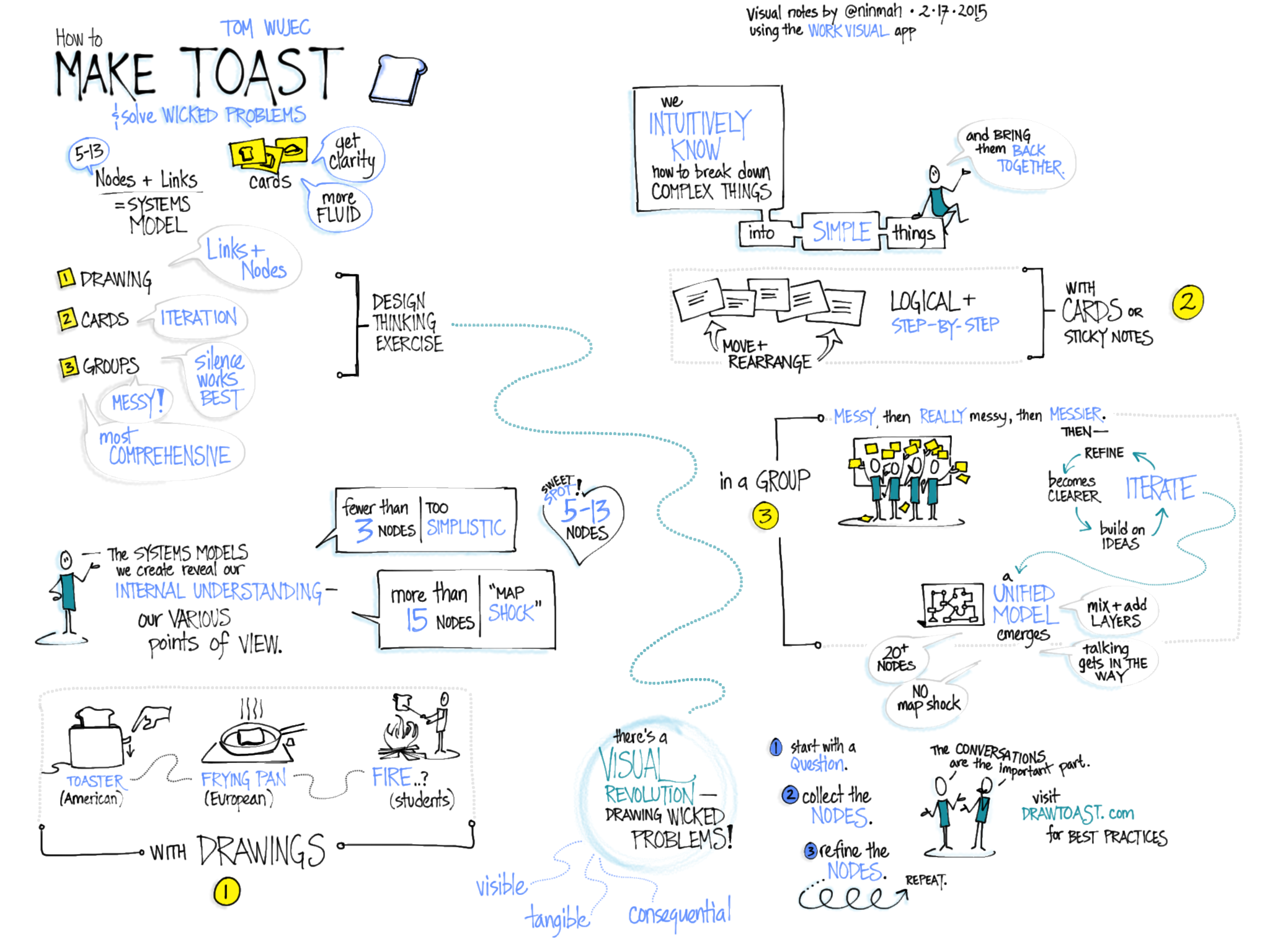
I started by doing random doodles to get a feel for the interface, but of course the only way to really test it was to do some visual note-taking. I had been meaning to watch Tom Wujec’s TED talk on Solving Wicked Problems, so I fired it up and went to town. Disclaimer: I listened to it twice, and made liberal use of the pause button the second time, because the newness of the interface slowed me down a lot. (Know your tools!) Here’s the result, which doesn’t look substantially different from what I might have done with my old favorite, the original Brushes app. Click to see it larger:
Visual notes of Tom Wujec’s TED talk, Wicked Problems, made during a trial of the beta version of the Work Visual app.
LOVE IT: What I already adore about the app!
I love the clean interface and the ease of switching layers and brushes.
I love that I can customize four brushes and they are right on the toolbar.
I love the zoom in (but not the zoom out, see below).
I love the line quality, which for me is one of the most critical components. Nailed it!
WISHES: What I would wish to see in future versions.
Double-tap to zoom out. If there is a quick way to zoom back to full screen, I never found it. This is what gave me the most trouble during my practice run.
I don’t know if it was the iPad I was using (I had to borrow one*), but the panning kept sticking while I was zoomed in. I’d start dragging with two fingers, and sometimes nothing would happen. This slowed me down a lot too.
There’s a strange thing that happens when one line crosses another, like when I’m lettering. At first I was disturbed by it, but then I realized that it wasn’t permanent and I was able to ignore it. What happens is that the color gets shifted around the crossed lines (on the left), but once you zoom or pan, it goes back to normal (on the right).
(Left) Color shifting when lines cross; (right) back to normal after zooming.
I wasn’t able to test the projection capabilities today, but I am super excited about them because it means you can FINALLY do graphic recording on the iPad while hooked up to a projector and not have to distribute airsickness bags to the audience beforehand. You can set it to only show the full screen, no matter how much you’re zooming and panning. Hurray! I also couldn’t test the video export but I hope to be able to once it’s ready.
I am so looking forward to the release of this app! Want to follow along while Holger develops it?
* Why I couldn’t use my own iPad: I’m still using the original Brushes app to create videos. Unfortunately, the export features of the original Brushes don’t work with the newest iOS. Also unfortunately (for me), TestFlight, which you need in order to test Work Visual, doesn’t work with older versions of iOS. So Brushes and the Work Visual beta cannot coexist on my iPad.
When I’m doing graphic facilitation or recording, people often come up and ask me how I came up with those icons while they were talking. Naturally, I tell them that I didn’t! Like most graphic recorders, I don’t invent many new icons on the fly. I practice them in between sessions, pulling ideas from all kinds of sources, both digital and print. And I snag ideas from other graphic recorders whenever I can. That way, when I get up to the wall, I already have a visual vocabulary to use.
If you’re new to the whole visual vocabulary idea, you’re in luck: May was Visual Vocabulary Month on Verbal to Visual, Doug Neill’s blog. He covered why you do it, how to organize it, how to get started, and how to make it a regular practice. Take a look at the wrap-up post that describes it all.
If you’re new to the whole concept that we’re all able to draw, you’ll want to head over to Jeannel King’s series of Good Enough Drawing Tutorials. Jeannel creates these nifty little quick tutorials that show you how, with a few simple lines, to draw anything from birthday cakes to bats. Take a look at the Resources section of her site while you’re there.
Then get out there and add something new to your visual vocabulary this week!
I’ve finally gotten around to rebuilding my feed reader (my previous reader collapsed under its own weight from the astonishing number of unread posts). I’m being rather more selective this time around. Here are a handful of blogs that I’ve added on the topic of sketchnoting:
Mike Rohde’s book, The Sketchnote Handbook, has helped pave the way for new sketchnoters. (Plus, Mike invented the term ‘sketchnotes.’) He also has a blog, some cool t shirts, and a forthcoming workbook to go along with The Sketchnote Handbook. Highly recommended. Check the blog for a series of videos about producing the workbook.
Doug Neill’s mission is to teach sketchnoting skills broadly, so people can apply it to whatever they are working on. Find sketchnoting tips on the Verbal to Visual blog and listen to Doug’s podcast series featuring visual thinkers. Doug is also working on a book on building your sketchnoting skills.
Started by Mike Rohde, Sketchnote Army is a showcase of sketchnotes from around the world. You can submit your own notes to be featured on the site, or just browse for inspiration.
Update, Feb. 2020: Voicemap is no longer available.
I’ve been playing with Voicemap, an online tool for adding audio and zooming points of interest to an image (like sketchnotes or a graphic recording). It hasn’t been easy. The instructions on the site aren’t very clear, and a lot of mistakes can’t be fixed without starting over. But I have finally completed my proof-of-concept Voicemap: An annotated review of visual notes I took during Doug Thomas’ TEDxUFM talk, “A New Culture of Learning” (link goes to the actual TEDxUFM talk).
(Voicemap no longer available)
Voicemap of my visual summary of “A New Culture of Learning” by Doug Thomas
Reflections
I really like Voicemap for the way it pairs audio with visual notes. Seems like it would be a great way to create a summary after a meeting: Upload the notes, then walk through them with a narration of the meeting’s highlights. Unlike the RSAnimate-style sketch movies, you don’t see the drawings being created in a Voicemap video — it starts with the image already finished — so it’s great for graphic recordings created during an event.
There are a few drawbacks. It looks like you have to publish the piece on Voicemap’s website, which means I can’t use it for many of my clients (too public). The format is better suited for pre-planned visual notes, or notes that are created after hearing the audio, so that you can walk through the image in a logical way. You’ll notice that I skipped around the page, following the flow of the talk rather than the visual structure on the page. That’s because I skipped around the page while creating the notes. Voicemap works better if you have a cleaner visual path to follow.
The most annoying thing is that the aspect ratio of the video when you edit it is different from the one you see when you view it (the editing one is 4×3, but the published one is closer to letterbox). The default embed code is also weird: it gives you a 640 x 640 viewer, which means your careful centering is shifted and everything is cut off on the right, with too much space on the left. The viewer above is actually cut off on the right side. If you want to see it more or less as it was meant to be viewed, try it on the Voicemap site.
Update: Voicemap contacted me and pointed out that I can change the width measurement to 640, which I did. This fixed the embedded display issue. To be fair, I did try that. I just changed it in the wrong place. Doh.
How You Do It
First, you start a project by entering some information about it (title, abstract, script, and so on). You can upload an audio file at this point also, although I had a great deal of trouble with that step. I tried several different formats (WAV, AIFF, MP3) and two different lengths (2:56 and 3:41). Eventually, the audio did load, but it took days in one case, and four or five upload attempts in another.
Once you get past that step, you can add a sketchnote image and set zoom points (points of interest, POI) that are timed to the audio track. You do this by listening to the track, pausing when you want to set a POI, then setting it and continuing. It really helps to have uploaded the script before you do this so that you can scroll through the script while you listen. When I did it that way, I found I could time the POI swaps better.
When everything is to your liking, you click Publish. From what I saw, publishing happens instantly.
Other Uses of Voicemap
It looks like graphic recorders can sign up with Voicemap, take a test, and become certified to do sketchnotes for audio clips that Voicemap sends them. Voicemap clients, then, can send in a script or audio clip and request a corresponding sketchnote video. The graphic recorders don’t get paid very much, but if you have an iPad or tablet, it looks like you could pick up a couple extra bucks illustrating Voicemap clips. I’m not sure how busy the service is yet.
Qrayon does it again! You may remember Air Sketch (which is still super awesome, by the way), the app that lets you wirelessly broadcast your iPad drawing to other devices on the same network while you draw it. This week, I happened upon another tool by Qrayon: Inkflow.
I am in love. Inkflow is a wonderful tool to blend digital and paper sketchnoting. You can use the app itself to take notes and organize them into books. You can also add typed text, images, and photos of notes you have taken on paper — which then become objects on the Inkflow page that you can move and scale with no loss of quality. Look at me, I’m so excited I’m jumping all over the place! Let’s get organized here and look at how Inkflow is for sketchnoting, the vector/bitmap comparison, a few key features, a list of what’s missing from my point of view, and whether or not I’d recommend it as a visual notetaking tool.
Sketchnoting in Inkflow
Writing and drawing in Inkflow is a beautiful thing. The flow is smooth, there’s no lag, and the canvas is large. Since I’ve only just begun to play with it, I’m using it as though it were Brushes, which is causing me some angst. But I can see that with a little practice I’ll get used to the way it works and do much nicer work. To test it out, I did a little visual notetaking while listening to the TED talk How Great Leaders Inspire Action by Simon Sinek.
My visual notes of “How Great Leaders Inspire Action” by Simon Sinek.
Click for a larger view.
Don’t let the non-white background alarm you; you can choose different styles. I just used the default for this one. You can actually change it after the fact, which rocks, and there’s a plain blank white one. It has a palm blocker too, so if you prefer a stylus you can pull up the palm guard to cover the bottom part of the screen.
One thing to note: A lot of the features I’m describing are only available in the paid version, which at the time of this writing costs $7.99. Definitely worth it.
Vector vs Bitmap
Inkflow is a vector drawing tool, which means that what you draw is stored as resizable objects. However, it behaves a little like a bitmap drawing tool (like Sketchbook Pro), which means that it feels like you’re painting with a brush. The lines are smoother and more even than I’m used to, and I can’t quite get the same variable quality of line that I love in Brushes (which is also a vector tool with a brushlike feel). The trail-off at the end of a stroke is different, too, which makes my lettering look a bit sloppy to my (self-critical) eye.
However, one of the coolest features of the vector-based Inkflow is that you can select, move, and resize parts of your drawing (or the whole thing). You can enlarge small things and they won’t get fuzzy, or shrink big things and they won’t get muddy. Oh, and if you need to rearrange your notes as you go, you can! File the selection tool under A for Awesome.
Adding Text or Photos
If you don’t feel like writing, you can type instead, and then draw or write alongside the typed text. You can also drop in photos or illustrations alongside your work, or annotate them. The stationery feature lets you pull in images to use as custom backgrounds (did someone say templates?).
Adding Paper Notes
I love this part. I have a bunch of notes I took on copy paper (you know, analog) for different meetings for whatever reason. I’ve been carrying them around in a folder and trying to decide what to do with them — I’m in an awkward place between using a paper notebook or my iPad at work, so I have notes in both places. Yuck.
With Inkflow (the paid version), you can take a photo of your paper notes and they get pulled into your Inkflow notebook. They become a vector image, so you can resize them up or down, move them around, select part of them, erase the little smudges around the edges… it’s totally cool. Now I have a work notebook that includes my loose notes, plus I can add as many pages as I need to for notes during meetings. Whoa.
What’s Missing?
The things that are keeping Inkflow from being absolutely perfect for my needs (I know, like it’s all about me, right?) are, in order of importance:
A lack of layers. This is the biggie, because I want to be able to draw outlines and color them in later, with the color underneath the outline. I also want to be able to experiment with stuff and get rid of it easily if it doesn’t work out. Update: Qrayon says they are working on a ‘draw-under highlighter’ that might help with this. Yay!
No quick way to zoom out to 100%. This was pretty frustrating while I was recording the sample. I do a lot of quick zoom outs to check size and placement of elements, and it’s annoying to have to do the pinch thing several times to make sure I’m looking at the right view.
Limited sizes and shapes of the brushes. Three brush shapes plus an eraser is actually okay; I can live without the airbrush. But the settings for tip size aren’t fine-grained enough for me. For instance, on the paintbrush, you can pick 24, 32, 48, 64… you get the idea. Nothing in between. I also miss being able to easily draw a dotted line. I use that a lot.
A limited active color palette. This is annoying, but it isn’t a show stopper. You have access to lots of colors, you just can only pick eight of them to use without mixing at any one time. Update: Qrayon responded to let me know that you can swipe the palette sideways for more colors, which I hadn’t realized. Definitely helps with setting up colorsets.
Zoom only goes to 12%. This bothered me a lot at first and then less as I learned to work with the app. I wanted to zoom in further, but I found that if I just worked at a slightly larger scale it was actually okay. I still would like a little more zoom action for that extra precision I like in my lettering. I love that the screen stays at full resolution even when I’m zooming.
So, Overall?
Overall, I love Inkflow and I’m looking forward to using it to take notes in my next meeting. It effectively combines several of my favorite features from other sketchnoting apps, it’s easy to use, and I love that it’s vector-based so I can move stuff around. Easily 4 out of 5 stars, and adding layers would kick it up to a 5. If you’re looking for a notetaking tool that’s simple but versatile, I can recommend it.
Updated 5-3-2014 with some news about color palettes and an upcoming draw-under tool.