Tag Archives: ipad

Help! They want me to do remote graphic recording next week!

With many face-to-face events (wisely) being switched to remote events right now, I’ve seen a lot of questions go by on Facebook from graphic recorders who are being asked if they can work their magic remotely. You can! Even if you’ve never done it before, you can. I’ve got you.

My first (test) recording using the Concepts app

The screen shots in this post were made using Concepts on an iPad. If you have a different drawing app, a non-iPad tablet, or you’re using a drawing tablet with your computer, the basic points are the same; just find the equivalent tools in the application that you have. Check the bottom of the post for a list of common applications and links to their tutorials.

Here’s the list of what you need to know.*

  1. Set up three brushes and an eraser.
  2. Choose a simple and limited color palette, and save the palette for quick reference.
  3. Set up three layers, name them, and don’t panic when you get them mixed up.
  4. Set aside 2-6 hours just to practice.
  5. Get a headset that’s comfortable and reliable.
  6. Ask for a 30-minute tech check sometime before the meeting begins.

Those are the basics. Everything else is optional for the moment.

There is a little more detail to each of those steps, of course. Let’s take a look.

1. Set up three brushes and an eraser.

I use a small solid brush for most of my lines and letters; a larger solid brush for color fills; and a slightly larger watercolor brush for shadows and pastel effects. My eraser is usually sized in between the two solid brush sizes.
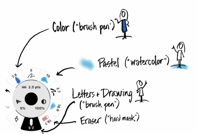
My brushes in Concepts. The numbers are the size in pixels (2.5 for the outline, 19.7 for the eraser, 10 for the pastel, and 7.4 for the color fill). Ignore the other brushes for now.

If you want to do solid titles rather than outline & fill, you will also want a larger brush for the titles (or know how to quickly switch between a large and small pen size for your single lettering brush).

Pro tip for neat lettering: With the canvas at 100% zoom (that is, fully zoomed out so you can see the whole page), make a mark like the upright of a capital letter (like P or R or I or D) at the scale (size) you want to write in. Zoom in to a comfortable level for writing, note where the upright is, tap undo to get rid of it, and start writing where it was, at the scale that it was. Zoom out now and then to check your orientation.

I set my brushes up in advance and save them for easy access. Ideally, you will be able to see them all at the same time and just tap to switch.

Can you use more? Sure. Do you want to? Eventually. This week, stick to three. Trust me.

2. Choose a simple and limited color palette, and save it for quick reference.

This one is so important that it’s worth looking up a tutorial for how to do it in your tool if it isn’t obvious. My most basic palette has black, a pastel blue, a pastel grey, a bright blue, and red. Sometimes I swap in another color for the two blues for different recordings. I also have white in my palette, but I use it rarely, and sometimes I include a yellow for glow and highlight effects.

My most basic color palette for the Concepts app. Concepts allows up to 8 colors in one palette, so sometimes I add yellow.

I use black for lettering and for outlining my icons. Red is for emphasis. Light blue is for pastel effects and light gray is for shadows and fills (shadows are done with the pastel brush and fills with the color fill brush). Bright blue is for splashes of color in icons and titles.

Like the brushes, you want to be able to see all the colors in a permanent or flyout palette and just tap the one you need. Can you use more colors? Of course. Eventually. This week, keep it simple.

3. Set up three layers, name them, and don’t panic when you get them mixed up.

From bottom to top, the layers are: pastels, color, line-work. Or whatever names will remind you of those classifications. That way, your letters and outlines are on top, colors slip neatly behind the outlines, and you can gaily sweep pastels behind icons and letters with no fear of messing up the clarity.
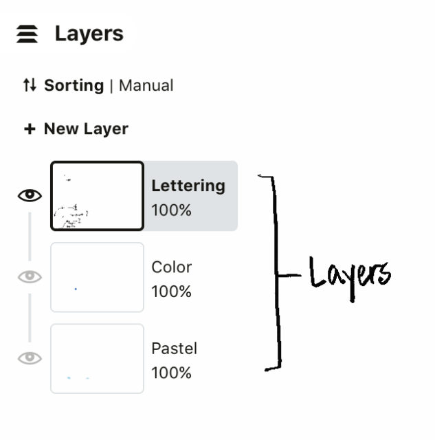
My basic layers setup. Concepts allows you to assign a brush to a particular layer, which helps make sure I don’t mix them up, but I still manage to do it sometimes.

You will mix up the layers at some point and put your outlines on your pastel layer or vice versa. If it’s the pastel on the outline layer, it’s immediately obvious and you can hit ‘undo’ and fix it. It’s harder to notice when you start writing on your pastel or color layer. Don’t stress when you do notice, and don’t undo a lot of writing. Just make a new layer, drag it to the bottom of the stack, and start using that for your pastels or colors as needed. There are no layer police and you will be fine.

4. Set aside 2-6 hours to practice.

And you can guess which end of that scale I’d rather you were on, right? The more you practice, the calmer you will be; the calmer you are, the better your work will be. It will take a while to get the hang of zooming in to write and zooming back out to check sizing, of switching pens and colors, of working with the layers. Don’t stress.

The very first graphic recording I ever did on an iPad, back in 2011.
… And this is a few years later, in 2014. See where a little practice will get you?

Here’s a practice regime that I use when testing a new drawing app:

  • Set up layers, pens, and colors. Take time to mess with the settings until you understand how they work — up to 30 minutes.
  • Write your name, draw some icons or people, practice the stuff that makes your work yours — about 15 minutes. This is not the most valuable practice activity, so don’t spend the bulk of your time here. This is just a warm up.
  • Find a photo of a chart you’ve done that you like. Try to recreate it on the iPad. This will teach you more about how your app works than almost anything else. Notice what you can and can’t recreate, adjust your brushes and colors, and get comfortable with your own style — up to 3 hours. I don’t recommend tracing a photo, because you won’t really understand how your app handles scale if you do that. Instead, look at a copy of the chart and recreate it on a blank screen.

    Next, go to TED.com or find a podcast or a news channel or something that you can listen to and record. Pick an episode and play it. Record it as it plays, then play it again and just look at your recording while you listen. Notice what you got and what you missed. You’ll miss more than you are used to, especially at first, but always.

    Let me say that again. You will always miss more when you are digitally graphically recording than when you are doing it on paper. Everyone does. It’s because the interface is more complicated than paper and pen, so a part of your brain that usually helps you listen and record is always dealing with the interface instead.

    Play another video or podcast and record that one. Do this three or four times. Take a minute to compare your last one with your first one — see the progress? You can totally do this.

    This is also the time when you want to get yourself into weird interface places so you can get yourself out of them. If you accidentally hit a button and the whole screen changes and it takes you 15 minutes to figure out why and how to undo it, that’s a gift: next time it happens, you’ll know how to fix it.

    Spend up to 2 hours on this part.

So much for the recording part. The rest is technical details.

5. Get a headset that’s comfortable and reliable.

You’ll work better if you can hear clearly and if your ear doesn’t hurt (ask me how I know). ‘Nuff said. I use the Plantronics Savi 730.

6. Ask for a 30-minute tech check sometime before the meeting begins.

The tech crew will want to know a couple of things from their end, but they don’t know what you need to know. Here’s what you need to check:

  • Ask to be put in the exact audio setup that the meeting or conference will use, and ask someone to speak from the place(s) where the speaker(s) will be sitting or standing. (If it’s a Zoom meeting where everyone will dial in separately, you don’t have to ask for this specially, because the tech check itself should be set up the same way.) Make sure you can hear.
  • Test how to mute your microphone so that you can cuss if you need to without everyone hearing it. (Again, ask me how I know.) Make sure you really are muted and that you know how to unmute. Clarify whether it’s okay for you to speak up if you can’t hear, or if there’s some other way they want you to handle this, like typing in the chat box or texting someone.
  • Share your iPad or tablet screen into the meeting and get them to confirm what they can see. Draw a little, and ask them to tell you how fast it shows up for them. Notice if there’s any drawing lag on your end while you are connected that isn’t there when you’re not connected (there shouldn’t be, but it’s not unheard of).
  • Ask whether they expect to switch between you and anyone’s slides or other shared materials, and get clear on what the schedule and expectations are if that’s going to happen. If you will have to click buttons on your end to make this happen, practice sharing and un-sharing your screen until it’s easy.

Make sure your device is charged, including the stylus, if you’re using an Apple Pencil or other stylus that has a battery. If possible, plug in to power while you work. If you’re using an iPad with Zoom, connect your iPad to the computer with the charging cable and share it through the cable. You’ll get a better connection and your iPad will charge while you work.

Finally, and perhaps most importantly, don’t panic. Stuff will go wrong. You’ll lose a brush or a color. You’ll mess up layers. The app will quit in the middle (or you’ll accidentally hit the round button and minimize the app when you didn’t mean to; ask me how I know…). Just keep breathing. It’s not the end of the world. Everyone is upside down right now because of all the rapid changes and the uncertainty of what will happen today, tomorrow, or next week. Be calm, and people will support you as you do your best, even if you screw up.

Ask me how I know.

Q & A

Q. What if my app can’t hide my drawing tools?
This is a nice-to-have feature, where you can see the tools but the participants can’t. If the app you choose doesn’t have it, don’t worry about it. It’s infinitely better to use an app that you are comfortable with that doesn’t have this feature, than to struggle with one you don’t like that does.

Q. Should I use the lasso tool to move or resize stuff?
Not if this is your first rodeo, no. (Sorry-not-sorry about the pun.) You can tweak it post-production if it really bugs you, but just go with what you’ve got while you’re working live. Better to keep moving.

Q. My app lets me make icons ahead of time and just paste them in, but you didn’t mention that. Why not?
Because it will slow you down. It feels like a shortcut, but as you’re learning how to listen and write and use the app, it will slow you down too much. It’s tempting, but leave it for now. You can work up to that later.

Q. What’s the best drawing app to use?
If you are totally at a loss as to where to start, try Procreate. I’ve done these screen shots with Concepts because it’s what I currently use when I record, to the point that I’ve lost facility with other apps. However, I don’t recommend Concepts to a beginner. It’s powerful, but boy is the interface confusing. Plus it lacks a quick way to zoom back to 100% size, which can trip you up.

In reality, the best app to use is the one that feels good to you, which may or may not be Procreate or Concepts. Try a few and see which seems to make the most sense, then use that one. This is worth taking a little time to do.

I’ve listed some common options here; there are others. Some of these may not have all the features I mention in this article, like a watercolor brush or layers. If you find that you love one that doesn’t have those features, great. Make it work for you using the tools that it does have. I’ve also linked to a tutorial for each app, when I could find a good one.

Q. What’s the best stylus to use?
Again, the one that feels most comfortable to you. I use an Apple Pencil.

Q. You’re sure I can do this?
Positive. You got this. Go help people stop traveling.


* This is the crash-course, bare-minimum, starting-from-zero-got-to-do-it-in-five-days level of information. There’s a lot more to it than this, but this will get you going.

How to Make a Movie with WorkVisual Exporter (Alpha Version)

Even if you don’t have access to the original Brushes app, you can make movies of your iPad drawings and sketchnotes again thanks to the new WorkVisual app. As the developers say in no uncertain terms, the Exporter tool is in alpha release. It’s not an easy process, but it’s possible!

A lot of the setup only needs to be done once, and after you get your workflow underway it goes faster. Keep in mind that these instructions will only be useful until the alpha software changes. Also note that the WorkVisual Exporter only works on the Mac at the moment.

THE DEMO MOVIE

I used an old diagram I drew a while ago so that I could test a movie with tracing for this demo. Read on for the long and detailed instructions on how to get your iPad drawing into a file you can open in your favorite video editor.

After following Steps 1-4 below, I imported the .mov file and still frame into Final Cut Pro X, sped the movie up, and added the title that looks like a piece of tape.

A. THE EASY PART: Drawing on the iPad

  1. Open a new drawing in WorkVisual and set up your layers.
  • Create 3 layers and don’t reorder them. This is very important. Because of a bug in the Exporter, the movie will show layers in the order they were created, so if you reorder them, your movie will not look right.
  • Import a picture if you are tracing. It gets placed on a new top layer. Drag it to the bottom. Because of a bug that this time works in our favor, the imported picture will be invisible to the Exporter, so it doesn’t matter that you reorder this one layer.
  • Set opacity on the picture layer down low enough that you can see it but it won’t get in your way. (Ignore this step if you didn’t import a picture.)

The way the layers look at the end

What the layers look like when the drawing is finished.

  1. Start to draw or write.
  • Use the top layer for your outlines, text, and other top-level content.
  • Use the second layer down to color in shapes you have drawn.
  • Use the third layer down to add shadows or airbrushing under the colors and shapes.

Detail of the drawing

Detail of the drawing. The outlines are on the top layer, the colors on the next one down, and the shadows on the one under that. The bottom layer is the tracing (set to 0% opacity and invisible at the moment) and the other one is a rogue layer that sneaked in there.

  1. When you’re done, go back to the Gallery to send yourself the file you need.
  • Tap the Share button.
  • Choose Export for Mac Tool.
  • Mail it to yourself (mail needs to be set up on your iPad and you need a wifi or cell connection.)

The Share button in the gallery

Gallery and share button.


B. THE HARD PART: Creating the Video File on the Computer

There are four main steps: Install the WorkVisual Exporter; install or identify a program to handle your image sequence; export your image sequence; turn the image sequence into a video file.

Step 1. Install the WorkVisual Exporter.

  1. Download the WorkVisual Exporter in exchange for leaving your email address for update notifications.
  2. While you’re there, you may wish to look through the workflow description on the same page. It’ll help the rest of this post make more sense.
  3. The download link gets emailed to you, so check your email, click the link, and save the file where you can find it again.
  4. Go find the file and double-click to open it. It’s a .zip file, so this will unzip the Exporter.
  5. Double-click the Exporter to launch it. If your computer asks you if you really want to open it, search your soul and do as your conscience dictates. If you decide not to open it, you’re done but you can’t make a movie. Otherwise, read on.
  6. If you wish, you can drag the application icon to your Dock, or place it in your Applications folder so you can find it again later.

Step 2. Install (or identify) a program to handle your image sequence.

Leave the Exporter alone for a moment while you get the second piece of software you need: the one that will turn the image sequence into a movie. There are a lot of choices for how to do this, ranging from free to expensive.

Things to know:

  • Beware of the free tools you might find by doing a web search. Image and video converters are notorious for containing malware. Not all free tools do, but use common sense when making your selection, and do a search on the name of the tool to find reviews and comments.
  • Photoshop can apparently convert images into video, but each frame becomes a new layer. The Exporter generates a LOT of frames. I don’t know how many layers Photoshop can handle before it goes nuts, but I’d be careful.
  • Adobe Media Encoder can also do this, although I found it frustrating when I tried it and eventually went with QuickTime Pro 7.
  • I gather that Adobe After Effects can also do it, though I don’t know how to use it.
  • It’s possible that Final Cut Pro X does it, which would save a step, but I haven’t figured it out yet. Final Cut Pro 7 used to do it but that was a while ago.
  • Most tools want you to only open the first image in the sequence. Don’t select and open all of the images, or it won’t work.

I chose to use QuickTime Pro 7, which is very old but still available and still functional. Please note that although QuickTime is built into OS X, the function that we need isn’t. You can have QuickTime 7 installed right along with the one that comes with OS X. If you don’t have QuickTime Pro already, you can buy it for $30.

Installing QuickTime Pro:

  1. Check your Utilities folder to see if you already have QuickTime Player 7. (Look in Macintosh HD > Applications > Utilities).
  2. If you don’t have QuickTime Player 7, you can download it here (free and necessary in order to upgrade to Pro).
  3. Double click the download file and follow the instructions to install it.
  4. Once you have QuickTime Player 7, open it by double-clicking it.
  5. If you already had QuickTime Player 7, check to see if you have the Pro version by choosing Registration from the QuickTime Player 7 menu (upper left, next to the Apple menu). If you see a code in the box, you are good to go. No code? Just installed it? Read on.
  6. If you need to get QuickTime Pro, you can buy it here.

Here is a good, if old, QuickTime overview for your reference.

If you prefer to explore other options, try searching on ‘convert image sequence to video’ or look at the article Convert an Image Sequence to a Movie by Andrew Noske.

Step 3. Export Your Image Sequence.

Now you’re set up, and you don’t have to do Steps 1 and 2 again for your next movie. From here down is the repeatable part.

  1. Go back to your email and look for the one you sent yourself with the drawing file attached.
  2. Download the attachment and save it in a new folder somewhere. Don’t skip the step of making a folder. You can thank me later. Also, don’t change the .workvisual part of the filename. You can change everything before the dot if you want.
  3. Go back to the WorkVisual Exporter that we launched and left running while we installed QuickTime Pro 7.
  4. Go to the File menu > Open, and navigate to the file you just downloaded. Open it.
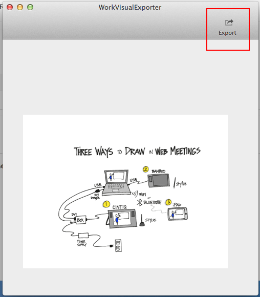
  5. The image shows up in your WorkVisual Exporter window.

The Export button

My drawing in the Exporter window. The Export button is highlighted.


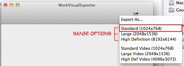
  1. To export the image sequence, click the Export button in the top right of the Exporter window.

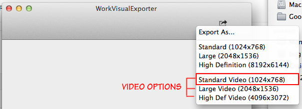
Video options in the Exporter

Video export options. Use the Standard one.

  1. The top three options will export a nice JPG for you, but that’s not what we want.
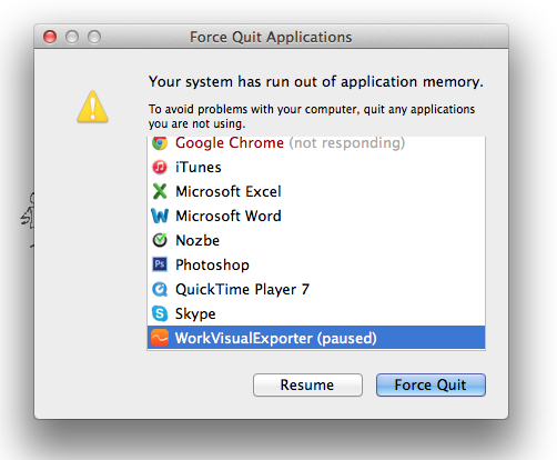
  2. The bottom three options export the image sequence for video. That’s what we want. Pick the standard definition. NOTE: Your computer can run out of application memory and crash if you use the large or high-def settings. Even a nice, new computer. USE WITH CAUTION. This is a bug and they’re working on it.


Out of memory alert

This is what you’ll see if you run out of application memory.
Force quit the Exporter, shut everything else down normally, and reboot.


  1. Make another new folder inside the other one and name it Image Sequence or something equally memorable. You want all your images to go into one folder that has nothing else in it.
  2. Save the file with whatever name you want but MAKE SURE YOU ADD .jpg to the end of the name. If you skip that, this will not work.
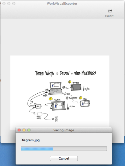
  3. You’ll see a “Saving Image” progress bar. Let it do its thing, go get some coffee, whatever. It’s best if you don’t try to do anything else with your machine while it’s exporting.


The progress bar

There it goes! Don’t mess with it. Just walk away.


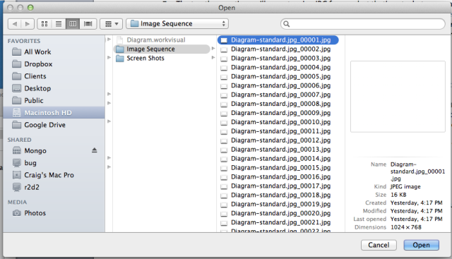
  1. When you get back, there will be a bunch of .jpgs in the new folder, all neatly numbered in order. Don’t change the filenames.
  2. It’s useful to export a still frame at the same size as your video, so go ahead and do that now using the first Standard setting. Remember to add .jpg to your filename. You’ll use this still frame in your video editor, adding it at the end of the video so that you have a nice hold for a few seconds when the drawing is done.


Image options in the Exporter

Choose the same size for the image as you did for the video.


Step 4. Turn the Image Sequence into a Video File.

To do this, we’ll use QuickTime Player 7 (even though we upgraded it to Pro, it’s still helpfully called Player). We just need to tell it which image to start with and what settings we want. If you chose a tool other than QuickTime Pro 7, you’re on your own here, but the process should be generally the same.

  1. Switch to QuickTime Player 7, or launch it if it isn’t open.
  2. Ignore the default window or close it if it’s in your way. Go to File menu > Open Image Sequence… and select the first image in your folder.

Opening an image sequence

Only select the first image, not all of them.


  1. Set your frame rate. I used 30, which is a standard frame rate. (24 and 29.97 are good too.) If you want to learn more, read this article on frame rate or play with this demo.
  2. Click OK, then wait a bit while nothing appears to happen. After a moment, your video will open. It’ll look like a blank white screen. Click the Play button at the bottom of the window to preview your video. You’ll notice it’s pretty slow. You can fix this in your video editing program later.
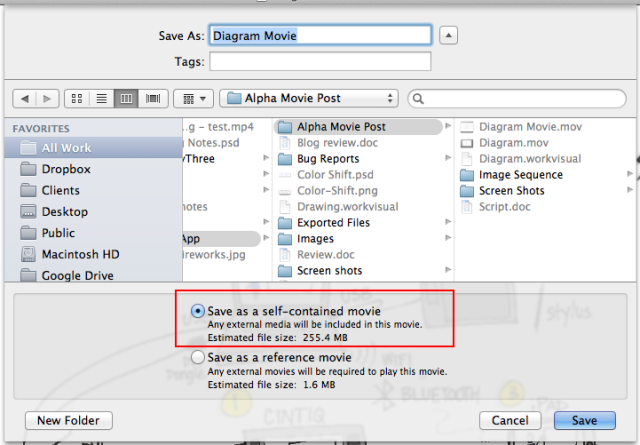
  3. Save the file as a self-contained movie and you are good to go. Ta da!

Using self-contained movie option

Choose self-contained movie.


If you want to fiddle with settings, you can choose File > Export… and play with different formats and different options for each one. The Save method described here results in a pretty large file size but you will get good quality.

The Other Part: Making a Whole Movie

I’m not going to cover this in detail because there are lots of great tutorials out there for making movies (one of my favorites is Izzy’s Final Cut Pro tutorial series).

  • Open your favorite video editing program (I use Final Cut Pro X, but iMovie, Premiere, or any other program will work too).
  • Import the video file and the still frame you created in the previous step.
  • Add audio, a soundtrack, still images, or whatever else you wish.
  • Adjust the timing so it’s faster or slower or whatever you need.
  • Place the still frame at the end of the drawing sequence to give people a moment to absorb the finished drawing.
  • Render it out and there you go!

If you try this process and discover something new, or if your experience with it is different, please share what you found!

A Digital Graphic Recorder’s Review of the WorkVisual App

Exploring WorkVisual

I admit I’ve been waiting for this app to be released ever since I first saw it demonstrated at EuViz 2014 by its creator, Holger Nils Pohl. I fell in love with the demo and instantly became BFFs with Holger (at least on my side). When the beta version was ready, I happily tested that, although I had to use a colleague’s iPad to do it. Now I’m thrilled to have the WorkVisual app on my own iPad and to have played with it enough to write up a review. (A long one.)

Lest you think that I am regarding this app through rose-tinted glasses, let me say right up front that it isn’t perfect. Read on to find out what I love, what I don’t love, and why despite its rough edges, this app is worth the $40 sticker price to me. But first, a video I created with the app yesterday:

See below for some notes about the video.


WHAT’S WORKVISUAL?

WorkVisual is a drawing app designed by a graphic recorder for graphic recorders. It’s optimized for digital note-taking, sketchnoting, and graphic recording. It isn’t a mind-mapping tool or a drafting tool. It’s designed for people who write and draw everything by hand. For those of us who know and love the original Brushes app, this is the first app that even comes close to reproducing the features and line quality of Brushes. Because it was designed by a graphic recorder, it adds some important features that even Brushes didn’t have.


WHAT I LOVE

In no particular order, these are the features that make me giddy with delight:

  • Presentation modes: WorkVisual has two modes for projecting the screen, Full and Follow. Set it to Full, and the projector keeps your work at 100%, showing the entire screen no matter how much you pan and zoom on the iPad itself—perfect for digital graphic recording in front of an audience. Set it to Follow, and viewers see what you see—perfect for teaching.
  • Gallery tags: I create a lot of drawings. WorkVisual has a tagging feature so that I can add the subject, client name, location, event name, or other labels to a drawing. Later, I can search on that tag to pull up all the related drawings.
  • Four spots for brushes: Access three custom brushes and an eraser with one single tap. This means a lot less fussing around in the brush menu.
  • Clean interface: The UI is incredibly simple and light. I had actually done two different graphic recordings before I realized that there’s no way to dismiss it. I simply stopped noticing it was there, except that all of my tools were always available.
  • Transparency lock: I love this, just love it. You lock the transparency of a layer, and then you can color over places you’ve already drawn, but nowhere else. Great for fixing mistakes where you wrote or drew in the wrong color accidentally.
  • Layer access: Switch to any layer with one tap. I switch layers a LOT and this makes my work so much faster.
  • Set as default: This hidden feature is super handy. In the Gallery, you can choose a drawing to set as the default, which means that any new drawing will start with that as the base. Great for setting up the titles and basic frames for a series of graphic recordings at an event.
  • Brush presets: Get your brushes just the way you want them and save a preset. Then, modify them for a custom job and save a different preset. Switch between them with a couple swift taps. Awesome.

And there are the features that are must-haves for graphic recording, for me at least:

  • Zoom: zoom way in, and double-tap to zoom out instantly. I use this all the time. Because the zoom is a double-tap and not a single one, you can tap-to-dot for punctuation, lettering, and so on.
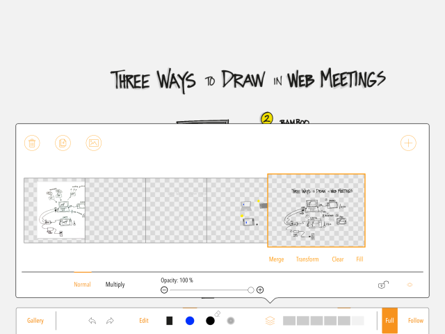
  • Layers: Up to six, which is enough for me. They have the standard features of merge, transform, normal & multiply modes, opacity, duplicate, add a photo, clear, fill, and hide.
  • Undo: Just like the original Brushes, if you undo something, it won’t show up in your movie. Yay!
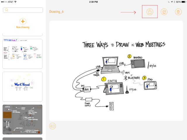
  • Export options: From the Gallery, you can mail a drawing as an image, save it to your Photos, or export the image sequence for the WorkVisual Exporter Mac tool (alpha).
  • Brush options: The brushes are customizable to just the right amount—enough flexibility to be useful without being confusing.
  • Color palettes: Create up to five swatch palettes of 15 colors each, plus you always have access to a custom color picker.
  • Eyedropper: Tap and hold anywhere to pick up that color, just like the old Brushes — yay!


WHAT I DON’T LOVE

Of course, there are a few things that aren’t ideal. Some of these might be bugs, and some are purely my preferences. I’ve shared the ones I think are bugs with the app’s creator, who is super and very open to feedback (thanks, Holger!). Again in no particular order:

  • Double-tap to zoom: This is a plus and a minus. It’s a plus because, as noted above, I can dot my i’s and punctuate properly. But I find that most of the time, the app reads my double tap as a single short stroke. The workflow looks like this: double-tap, double-tap, double-tap, double-tap, zoom, undo, undo, undo. I imagine for someone using a stylus, this would be difficult too.
  • Current brush shape doesn’t highlight: When editing a brush, it would be nice to know which brush shape was currently selected without having to look down at the brush button.
  • Brush sizes reset in between choices: If you set up a custom brush and change its pixel size, then use that same button to select a different brush temporarily, when you go back to the first brush it will have reset to the default pixel size. Creating and loading presets doesn’t help. This gets in my way because I have six common brushes and there are only four brush buttons, so I have to change to the other two when I need them. My basic brush keeps resetting from 3 pixels to 30. (Then again, maybe the app is just trying to tell me I write too damn small.)
  • ‘Undo brush’ notification: Every time you tap Undo, which for me is often, a little box pops up to let you know the brush is being undone. I have to wait for it to vanish before continuing. It doesn’t stay up long, but it breaks my flow and I would love to be able to turn it off.
  • Layer order in Export tool: There’s a bug (I assume) in the exporter tool that reorders layers when you export a high-res image or video. Since I usually create the text & outline layer first, then create the color layer when I need it and drag it underneath the first layer, this means that in the exported video my color is on top of my outline, which looks bad. You can see it in the video if you look closely enough.


WHY IT’S WORTH THE STICKER PRICE

At the time of this posting, WorkVisual sells for a pricey $39.99. I hear you. “For an app?! Are you nuts?” I know, I know. Here’s the thing. I’m a professional digital graphic recorder. This is a professional tool. It’s worth the investment. If your work involves drawing, sketch noting, or graphic recording with the iPad, this is the next tool you want in your toolbox. One job will cover it, you know it will.

When people ask me which app I recommend for graphic recording on the iPad, this is the one I will tell them to get if they are serious about it.


MY BRUSH CHOICES

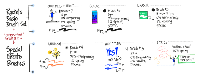
It’s all explained in the video, but here’s a reference for my initial brush setup (click it for a readable copy):


Screen shot showing Rachel's brush settings


I think I’ll change the basic brush from 3 pixels to 5 pixels, because there’s a lot more variability in the line at 5 pixels. Plus, it really wouldn’t hurt if I wrote a little bigger. That will probably mean I bump the Color and Eraser brushes up a couple of pixels too.


MY TOOLBAR SETUP

This is how I have my brushes set up, and how I arrange the layers as I create them:

Screen shot showing brush layout


It’s a screen shot right out of the app, and all the lettering was done in WorkVisual. That’s its actual toolbar.


MAKING THE VIDEO

I’ll post a detailed step-by-step in a week or so once I’ve gotten the process smoothed out. For now, the short version is that it is possible but you’ve really gotta want it. Here’s a high-level overview:

  • Create your drawing. There’s a bug in how the layers are rendered out, so it’s best to set up your layers before you start and don’t drag any layers underneath any others.
  • In the Gallery, use the Export for Mac Tool command to email the .workvisual file to yourself.
  • Open the .workvisual file in the WorkVisual Exporter (separate Mac application).
  • Export it as described in the instructions on the app website.
  • Use your favorite tool to convert image sequences to video (there is a WORLD of sub-steps hidden in this one). I haven’t successfully rendered a high-res video from the app yet.
  • Open the video in your favorite video editor, add a voiceover and soundtrack, and render it out. Ta da!

You can see the result above. Couple things to look for in the video:

  • Since I couldn’t render a high-res one, it’s tiny (540p). If I render it larger (740p or 1080p) the lines are very blurry and look bad.
  • That, combined with my tiny writing, makes it difficult to read the text.
  • I made a couple of mistakes and erased them, so you’ll see that happening. Other mistakes I used the ‘undo’ command to get rid of, and you won’t see those.
  • The layering bug means that everything I color shows up on top of the outlines in the video. It looked right when I was recording it, but because I had reordered the layers, it comes out wrong in the exported video. It’s correct in the final still image of the video, which is a screen shot of the app.


THE BOTTOM LINE

I’ll say it again: When people ask me which app I recommend for graphic recording on the iPad, this is the one I will tell them to get if they are serious about it.

I am thoroughly delighted with the app and ready to start using it as my primary digital note-taking tool. The initial release is a solid, robust app that does what it says it will do, with a clean interface and just enough features for graphic recording. I’m confident that it will continue to evolve and develop.

Because the Export tool is still in alpha, I’m not quite ready to kill Brushes in favor of WorkVisual, but I can see that happening down the road. This is good because my poor iPad is existing in a state of unstable limbo with iOS 7. I can’t upgrade to iOS 8, or I’ll lose Brushes’ ability to export high-res images and video completely. At the moment, Brushes is still the better option for creating video in terms of workflow and output.

With a little more work on the alpha Exporter tool, WorkVisual will soon be the app that I use most out of all the ones on my iPad.


Updated to add a mention of the Eyedropper feature that got left out the first time.

Join.Me’s Whiteboard for iPad: Graphic recorders, rejoice!

Join.Me, a web conferencing tool, has released a new feature in the mobile version: Whiteboard for iPad. It’s worth a look.

Overall assessment:

This is definitely a big step in the right direction for making digital graphic recording accessible for more people. With this tool, you can start, host, and graphically record a web meeting in seconds, all from your iPad.

detail of Join.Me's whiteboard on iPad

What is it?

Join.Me is a web conferencing tool (think WebEx, GoToMeeting, Adobe Connect, Zoom, and so on — there are lots.). This one has a hip, friendly vibe and is incredibly easy to use whether you’re on a desktop, a laptop, an iPad or other tablet, or a mobile device. Incredibly easy.

The thing that has catapulted Join.Me from ‘incredibly easy’ to ‘wow, just wow’ for me is its new whiteboard for iPad feature. I tested it today with some willing volunteers (thank you all, you know who you are) and I’m impressed.

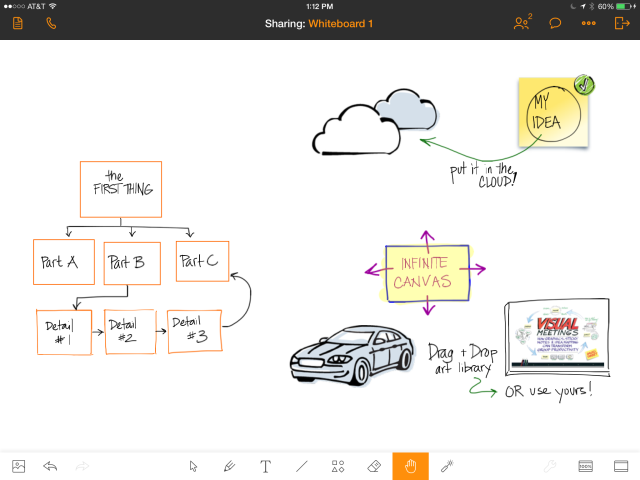
With the whiteboard, you can draw, write, create shapes, and import images from Join.Me’s easily-accessible library or from your own photos on the iPad. You can share it while you’re drawing it, so viewers can see your whiteboard. You can share other documents, too, once you get them into Join.Me. You can draw right on the iPad’s screen and everyone can see it whether they are joining the meeting from a desktop, a laptop, an iPad, or a mobile device.

With one tap you can be in an audio conference along with the screen sharing, which means you can start, join, and participate in web meetings on your iPad and share your iPad’s screen. Yes, that means you can now graphically record web meetings on your iPad and have everyone see it. Easily.

What’s it good for?

I can see using this in several ways:

  • To share concept sketches or other documents with clients, annotating them in real time while we talk, even if I’m sitting in an airport or a hotel room or anywhere else.
  • To graphically record web meetings and have everyone be able to see it, even if I don’t have my giant Cintiq handy.
  • To quickly create rough sketches to capture ideas during a meeting.

Desktop view of Join.Me whiteboard

This is what it looks like on the computer when someone is sharing an iPad whiteboard.


Likes & Wishes

What I like about the whiteboard tool:

  • Infinite canvas: You can just keep sliding your work to the side and adding more. Viewers can pan and zoom independently of the presenter, too, so they can go back and check details anytime they need to.
  • Zoom: Totally necessary for any drawing app, in my view. The zoom isn’t as smooth as I would like and it takes a couple tries to zoom out sometimes, but there’s a handy framing button that jumps you back and forth.
  • Drawings are objects: Everything is treated like an object, which is nice because it can be resized, dragged, removed, recolored, and so on. You can pull a sticky note out of the Join.Me library, write on it, and then move and resize the whole note.
  • Layers: I also really like layers in my drawing apps. This one has rudimentary layers, allowing you to move objects in front of or behind other objects.
  • Library: The sketch library provided with the app is nice. I like that you can also bring in your own art — which means you can create your own library of stuff that you use over and over. It’s really easy to drop stuff into the whiteboard from the library, too.
  • Audio: During testing, I tapped the little phone icon in the top left corner and joined the call from my iPad. The sound quality on my end was great, and my partner in crime told me she could hear me loud & clear too.

Join.Me whiteboard with zoom

The sticky note background, car, clouds, and book cover were pulled in from the image library and my photo roll. The rest was drawn in the whiteboard itself.


What I wish:

  • It still isn’t a collaborative whiteboard; only one person can work on it at once. If you pass the presenter role to someone else, your whiteboard stays with you, and they have to start a new one or share another document, so in that sense it’s like any other web conference screen share. However, you can email the whiteboard to yourself in JPG, PDF, or (game-changer alert!) native Join.Me format, so someone else can load it into their copy of Join.Me and continue working on it. I’m a big fan of any iPad app that lets you move your content around. BIG fan.
  • Like any other iPad graphic recording tool, it does slow you down. It just takes longer to navigate around the space, draw and write things. I wouldn’t try to do detailed graphic recording while facilitating a meeting using this tool.
  • You can’t use the whiteboard from the desktop version of Join.Me, at least not that I can see. You can watch, but you can’t create and share a whiteboard. Since you can create and share your screen using any application you have on your computer, this isn’t a huge deal.

Join.Me on the iPhone

What it looks like on my iPhone (sideways).

Where do I get it?

The app is available on the app store. If you don’t need to run meetings, it’s free. If you want to host meetings, you’ll need to visit Join.Me on the web and get an account. There’s a basic, free one that lets you have up to 10 participants, and there are pro and enterprise levels too.

There’s also a Join.Me desktop application that’s only necessary if the person on the computer wants to present. If they’re just attending, they can do that right in a web browser without downloading anything. (Did I mention easy?)

Working Visually with Think Tools in the Paper App by FiftyThree

FiftyThree, makers of the Paper app and the nifty Pencil, have released Think Tools, a new set of tools inside Paper that change what you can do with the app. If you have Paper, just update to get ThinkTools.

The new toolset lets you do rapid mockups, mindmaps, flow charts, and other visual prototypes quickly and (more or less) easily. While I am crazy about the new toolset, I have to admit that Paper and Pencil still frustrate me and there was some definite head-banging-on-chair-back while I was creating this test image. (Disclaimer: for reasons I won’t go into here, I am holding off updating my iPad to iOS 8, so although I am using the latest version of Paper some things might be different for me — and not in a good way.)

After playing with the tutorial and trying some random shapes for a bit, I decided to test it out by recreating a flow chart I made for my bedroom door when my young son had a sleepover with a few friends one winter holiday:

Thinking of waking me up? Check this handy flow chart first.

Thinking of waking me up? Check this handy flow chart first.


What I Love:
The quick and easy way you can draw shapes, move them around, and connect them with arrows. The promo video (which mentions visual facilitation, by the way, woo hoo!) shows some very cool examples of prototypes and early designs, and I see this as the key strength of the toolset. You can create and rearrange a diagram while you are in conversation with someone. Very handy, and I can definitely see using it a lot.

What I Like:
The variety of controls in the Think toolset: in addition to the smart pen that makes your shapes look nice and adds arrows automagically, there’s a scissors tool that lets you move things around, delete them, and copy/paste them (yay!). There’s a fill tool that lets you easily fill and clear fill from shapes as well as filling in the whole background. There’s also an eraser that I think is smart although it might just be that I was lucky when I used it, but it seemed to know about the edges of smart shapes at least a little bit.

What I Don’t Like But Can Live With:
The color mixer. It’s a cool idea and if I were painting I’d love it, but for what I do it just gets in my way and occasionally ends up with the wrong color selected so that I have to … Undo, which is another frustrating tool. The two-finger rewind is nice if you need to undo a LOT of stuff at once, but if you want to quickly get rid of the stroke you accidentally made because the app suddenly decided the Pencil was in fact your finger and you wanted to smear everything instead of writing, it’s a pain in the neck. Placing and moving two fingers correctly takes up way too much time and brain space for undo.

What Makes Me Bang My Head Against the Back of My Chair:
Writing. Oh, this is so painful. The zoom (loupe) has gotten a bit better, and now enlarges smartly when you get near the edges, but I consistently have problems with writing. If you write with the Pencil stylus, the app is supposed to understand that when you use Pencil you want to write and when you use your finger, you want to smudge. This would be super cool, again, if I were painting or drawing. But trying to create a flow chart or do notetaking, I find that sometimes the app stubbornly insists the Pencil is my finger and just smears in the middle of a letter (like when I’m writing the cross bar on the ‘T’ for instance). This slows me down so much that I lose the thread of what I’m trying to take notes on, which is a showstopper for me. So I switched Pencil off and just used my finger.

That got rid of the smearing problem, but the zoom is still problematic. There’s no way to re-center the canvas (that I’ve found), so if you want to write near the edges, it’s very difficult. On the top and bottom edge, I kept accidentally calling up the iPad’s pull tabs, which is irritating. I would love to be able to drag the canvas so that whatever I’m trying to write is in the most comfortable position — just down and to the right of center — so that my arm doesn’t get tired from holding my hand up off the screen. (I know, I know, Pencil is supposed to let me rest my hand on the screen. Not so much.)

So, a mixed review. I really love the new functionality of Think Tools. I still adore the little books that make up the interface, and the social-sharing capability is really cool. But I keep getting stuck on the difficulty of actually writing. If you have Paper, try it out yourself and let me know how you find it!

Testing the new Work Visual app

Today everything aligned perfectly — time, equipment, and perseverance — and I was able to test the new Work Visual app by Holger Nils Pohl. I am SO excited! These are some initial notes about my experience.

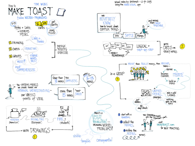
I started by doing random doodles to get a feel for the interface, but of course the only way to really test it was to do some visual note-taking. I had been meaning to watch Tom Wujec’s TED talk on Solving Wicked Problems, so I fired it up and went to town. Disclaimer: I listened to it twice, and made liberal use of the pause button the second time, because the newness of the interface slowed me down a lot. (Know your tools!) Here’s the result, which doesn’t look substantially different from what I might have done with my old favorite, the original Brushes app. Click to see it larger:

Visual Notes of TED Talk

Visual notes of Tom Wujec’s TED talk, Wicked Problems, made during a trial of the beta version of the Work Visual app.


LOVE IT: What I already adore about the app!

  • I love the clean interface and the ease of switching layers and brushes.
  • I love that I can customize four brushes and they are right on the toolbar.
  • I love the zoom in (but not the zoom out, see below).
  • I love the line quality, which for me is one of the most critical components. Nailed it!

WISHES: What I would wish to see in future versions.

  • Double-tap to zoom out. If there is a quick way to zoom back to full screen, I never found it. This is what gave me the most trouble during my practice run.
  • I don’t know if it was the iPad I was using (I had to borrow one*), but the panning kept sticking while I was zoomed in. I’d start dragging with two fingers, and sometimes nothing would happen. This slowed me down a lot too.
  • There’s a strange thing that happens when one line crosses another, like when I’m lettering. At first I was disturbed by it, but then I realized that it wasn’t permanent and I was able to ignore it. What happens is that the color gets shifted around the crossed lines (on the left), but once you zoom or pan, it goes back to normal (on the right).

(Left) Color shifting when lines cross; (right) back to normal after zooming.

(Left) Color shifting when lines cross; (right) back to normal after zooming.


I wasn’t able to test the projection capabilities today, but I am super excited about them because it means you can FINALLY do graphic recording on the iPad while hooked up to a projector and not have to distribute airsickness bags to the audience beforehand. You can set it to only show the full screen, no matter how much you’re zooming and panning. Hurray! I also couldn’t test the video export but I hope to be able to once it’s ready.

I am so looking forward to the release of this app! Want to follow along while Holger develops it?

Work Visual on Facebook

Work Visual on Twitter

* Why I couldn’t use my own iPad: I’m still using the original Brushes app to create videos. Unfortunately, the export features of the original Brushes don’t work with the newest iOS. Also unfortunately (for me), TestFlight, which you need in order to test Work Visual, doesn’t work with older versions of iOS. So Brushes and the Work Visual beta cannot coexist on my iPad.

Graphic recording of web meetings with the iPad – Yes, you can!

“So can I graphically record a web meeting on my iPad?”

That’s a question I get asked a lot, and historically, it has had a complicated answer. For a while, the answer was “Not if you want anyone in the web meeting to see your graphic recording while you’re doing it, no.” Then it was, “Yes, but only if they’re on the same wireless network you’re on, and even then it’s a lot of setup.” After that it was, “Technically, yes, but realistically, no,” because although it was technically possible to share your iPad’s screen to a desktop and then share the desktop’s screen in a web meeting, it wasn’t easy, smooth, fast, or reliable. As of last week, the answer has changed again.

That’s because last week, Squirrels released Slingshot, the first really workable solution that I’ve seen for real-time graphic recording in a web meeting using an iPad. Is it perfect? Nope. Is it good enough? Yes, for some situations. Is it for everybody? Nope.

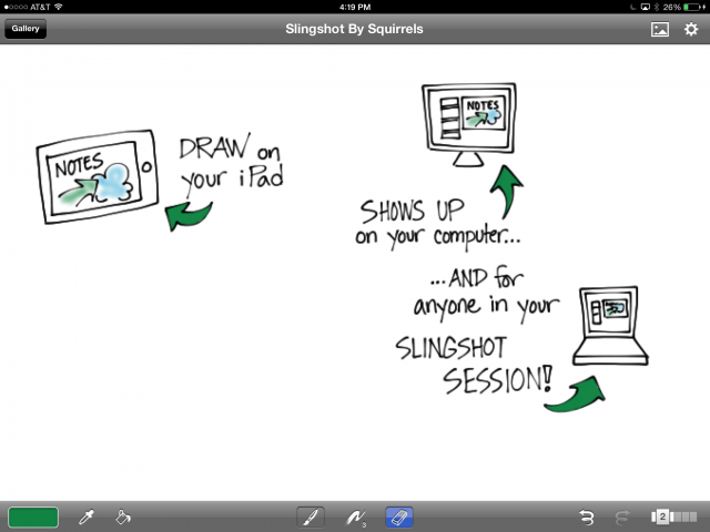
Screenshot of iPad

My quick iPad drawing (screen shot from iPad).
I’m zoomed in a little, which is why it looks a bit fuzzy.

How Does It Work?

Slingshot lets you host a web conference in a snap from your desktop computer or mobile device. If you’re hosting from your desktop, you can use Airplay (built into your iOS mobile device) to mirror your device’s screen to your computer, where it is automagically screen-shared with everyone in the web meeting. Once I had downloaded and installed Slingshot on my computer, it took about five minutes to launch a meeting, connect my iPad, and share my iPad’s screen with someone in the web conference. I launched a drawing app on the iPad (Brushes in this case) and started drawing, just as I would if I were taking notes. My remote-viewing partner in crime (in this case my partner in many other things, Craig Smith) reported that the drawing was very smooth, no delay, no jumping around.

Squirrels also makes an app called Reflector, which mirrors your iPad screen to the desktop just like Slingshot. With Reflector, you have to join a web conference with something like Skype, WebEx, Connect, or Join.Me, and then share your screen. Slingshot skips all that by blending Reflector’s mirroring capability with an easy-to-use web conferencing tool, so you only have one thing to set up.

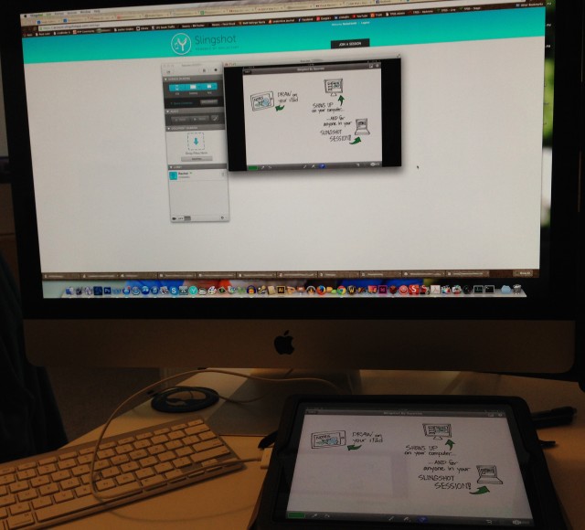
Photo of computer and iPad showing Slingshot

The iPad, where I was drawing, mirroring into Slingshot.
You’re seeing the Slingshot app floating over the Slingshot web page.
Don’t worry that the iPad is plugged in; it doesn’t need to be. I was just running out of juice.

Sounds Great! So Why Isn’t It Perfect?

First, because of how the mirroring works. Not only does your drawing get mirrored, but everything on your screen gets mirrored too — the palettes, title bar, whatever you can see. But we could live with that. The thing that really gets in the way is that the zooming gets mirrored as well.

To get good results and fit a lot of stuff on one screen, you need to zoom in when graphic recording on the iPad. Which is fine, except that when someone else is watching the screen and sees the zooming without any context, it’s very disorienting. I would be very careful about using this to record a web conference just because of the mirrored zoom. I wish there were a way to turn that off and just show the graphic recording unfolding without the zooming. That would be pretty darn close to perfect.

Second, you can’t do it just from the iPad, without the desktop computer. You still need to join the meeting on a desktop computer running Slingshot, and then you connect the iPad in order to mirror it. I really wanted to be able to join the meeting on the iPad and share the screen from there, but that’s not how it works.

The third reason isn’t particular to Slingshot. It’s just that live graphic recording on the iPad is not for everyone, regardless of how it’s shared in the web meeting. It’s slower than recording on paper and it requires more concentration, which means you can miss things. It’s much easier to get sucked into what you’re doing and forget to listen, especially if you’re not completely familiar with the drawing app.

Last but not least, both times I set up iPad sharing, Slingshot on my desktop crashed as I connected the iPad the first time. Once I relaunched and reconnected the iPad, all was well.

However, at long last, when someone asks if it’s possible to use their iPad to record a web meeting, I can say, “Yes! Yes it is.” Thanks, Squirrels!

Creating sketchnote joy with Inkflow by @Qrayon

Qrayon does it again! You may remember Air Sketch (which is still super awesome, by the way), the app that lets you wirelessly broadcast your iPad drawing to other devices on the same network while you draw it. This week, I happened upon another tool by Qrayon: Inkflow.

I am in love. Inkflow is a wonderful tool to blend digital and paper sketchnoting. You can use the app itself to take notes and organize them into books. You can also add typed text, images, and photos of notes you have taken on paper — which then become objects on the Inkflow page that you can move and scale with no loss of quality. Look at me, I’m so excited I’m jumping all over the place! Let’s get organized here and look at how Inkflow is for sketchnoting, the vector/bitmap comparison, a few key features, a list of what’s missing from my point of view, and whether or not I’d recommend it as a visual notetaking tool.

Sketchnoting in Inkflow

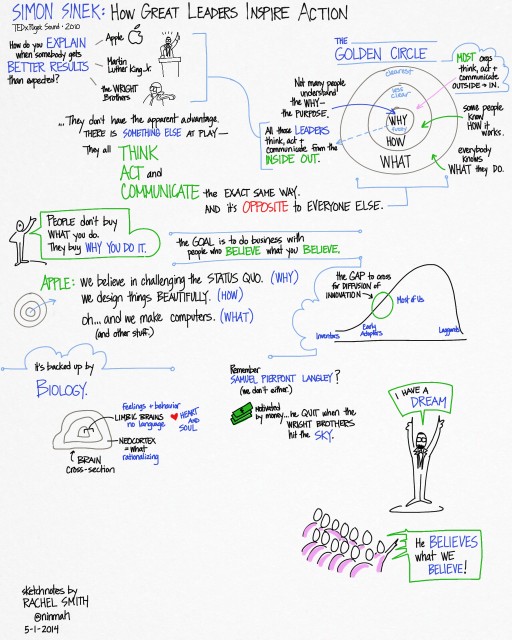
Writing and drawing in Inkflow is a beautiful thing. The flow is smooth, there’s no lag, and the canvas is large. Since I’ve only just begun to play with it, I’m using it as though it were Brushes, which is causing me some angst. But I can see that with a little practice I’ll get used to the way it works and do much nicer work. To test it out, I did a little visual notetaking while listening to the TED talk How Great Leaders Inspire Action by Simon Sinek.

Sketchnotes of Simon Sinek's TalkMy visual notes of “How Great Leaders Inspire Action” by Simon Sinek.
Click for a larger view.

Don’t let the non-white background alarm you; you can choose different styles. I just used the default for this one. You can actually change it after the fact, which rocks, and there’s a plain blank white one. It has a palm blocker too, so if you prefer a stylus you can pull up the palm guard to cover the bottom part of the screen.

One thing to note: A lot of the features I’m describing are only available in the paid version, which at the time of this writing costs $7.99. Definitely worth it.

Vector vs Bitmap

Inkflow is a vector drawing tool, which means that what you draw is stored as resizable objects. However, it behaves a little like a bitmap drawing tool (like Sketchbook Pro), which means that it feels like you’re painting with a brush. The lines are smoother and more even than I’m used to, and I can’t quite get the same variable quality of line that I love in Brushes (which is also a vector tool with a brushlike feel). The trail-off at the end of a stroke is different, too, which makes my lettering look a bit sloppy to my (self-critical) eye.

However, one of the coolest features of the vector-based Inkflow is that you can select, move, and resize parts of your drawing (or the whole thing). You can enlarge small things and they won’t get fuzzy, or shrink big things and they won’t get muddy. Oh, and if you need to rearrange your notes as you go, you can! File the selection tool under A for Awesome.

Adding Text or Photos

If you don’t feel like writing, you can type instead, and then draw or write alongside the typed text. You can also drop in photos or illustrations alongside your work, or annotate them. The stationery feature lets you pull in images to use as custom backgrounds (did someone say templates?).

Adding Paper Notes

I love this part. I have a bunch of notes I took on copy paper (you know, analog) for different meetings for whatever reason. I’ve been carrying them around in a folder and trying to decide what to do with them — I’m in an awkward place between using a paper notebook or my iPad at work, so I have notes in both places. Yuck.

With Inkflow (the paid version), you can take a photo of your paper notes and they get pulled into your Inkflow notebook. They become a vector image, so you can resize them up or down, move them around, select part of them, erase the little smudges around the edges… it’s totally cool. Now I have a work notebook that includes my loose notes, plus I can add as many pages as I need to for notes during meetings. Whoa.

What’s Missing?

The things that are keeping Inkflow from being absolutely perfect for my needs (I know, like it’s all about me, right?) are, in order of importance:

  • A lack of layers. This is the biggie, because I want to be able to draw outlines and color them in later, with the color underneath the outline. I also want to be able to experiment with stuff and get rid of it easily if it doesn’t work out. Update: Qrayon says they are working on a ‘draw-under highlighter’ that might help with this. Yay!
  • No quick way to zoom out to 100%. This was pretty frustrating while I was recording the sample. I do a lot of quick zoom outs to check size and placement of elements, and it’s annoying to have to do the pinch thing several times to make sure I’m looking at the right view.
  • Limited sizes and shapes of the brushes. Three brush shapes plus an eraser is actually okay; I can live without the airbrush. But the settings for tip size aren’t fine-grained enough for me. For instance, on the paintbrush, you can pick 24, 32, 48, 64… you get the idea. Nothing in between. I also miss being able to easily draw a dotted line. I use that a lot.
  • A limited active color palette. This is annoying, but it isn’t a show stopper. You have access to lots of colors, you just can only pick eight of them to use without mixing at any one time. Update: Qrayon responded to let me know that you can swipe the palette sideways for more colors, which I hadn’t realized. Definitely helps with setting up colorsets.
  • Zoom only goes to 12%. This bothered me a lot at first and then less as I learned to work with the app. I wanted to zoom in further, but I found that if I just worked at a slightly larger scale it was actually okay. I still would like a little more zoom action for that extra precision I like in my lettering. I love that the screen stays at full resolution even when I’m zooming.

So, Overall?

Overall, I love Inkflow and I’m looking forward to using it to take notes in my next meeting. It effectively combines several of my favorite features from other sketchnoting apps, it’s easy to use, and I love that it’s vector-based so I can move stuff around. Easily 4 out of 5 stars, and adding layers would kick it up to a 5. If you’re looking for a notetaking tool that’s simple but versatile, I can recommend it.

Updated 5-3-2014 with some news about color palettes and an upcoming draw-under tool.

Pencil and Book for Paper by 53

Do you take notes with the Paper app on your iPad? I haven’t used it very much, but after seeing these two tools, I think I will give it another go. Plus, it looks like zoom is available in Paper now, which is what I was missing before.

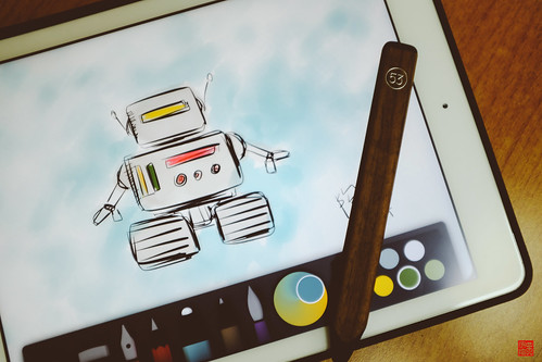
The first is Pencil, a Bluetooth stylus for the iPad that has an eraser and palm blocking (so you can rest your hand on the iPad surface while you draw with the stylus). It looks like — what else? — a pencil. The palm blocking and eraser features only work with Paper, but the stylus works with everything on your iPad. It comes in graphite or a beautiful wooden finish. I’m especially intrigued by the hint that they have handled the friction problem. I’m hoping this means that Pencil doesn’t feel too slippery or drag too much as some other styli do.


Pencil By 53Pencil By 53 by Daniel Y. Go, on Flickr (cc)


The other isn’t really a tool… it’s something you can do with your notes after they’re done. It’s called Book, and that’s just what it is. Moleskine and FiftyThree have teamed up to offer a printed and bound book with your notes from Paper in the lovely Moleskine format. I find myself wanting to create a set of new visual notes just to be able to get them as a Book. If you’re familiar with Paper, you know that notes are organized in virtual notebooks inside the app already. Book brings them to life. Imagine your notes from a conference or a course printed and bound afterward!

Speaking of which, do you run a conference? Consider hiring a visual notetaker to record the sessions in Paper, then send out copies of the printed version as a high-end conference giveaway. Ooooh. I even know a visual notetaker who would be interested.

Two Apps to Watch: bContext and Underlay Stripper

Well, one app, and one tool that makes another app work better:

bContext

bContext is an iPad app that lets you record drawings and annotate them with audio. Thanks to some embedded editing tools, you can import images and draw over them, record yourself talking about what you are drawing, and create a video of the whole process. The drawing tools are not quite ready for the kind of detailed work I tend to do on my iPad — yet — but I have high hopes that they will be.

I had the pleasure of meeting bContext’s co-founders, CEO Massimo Scapini and CTO Felipe Saint-Jean, a couple of weeks ago when they were in town for TechCrunch’s Disrupt SF 2012 conference, and they gave me a tour of some of the new features that are coming up. I also got to put a in good word for some of my favorite wishlist features. This is definitely an app to keep your eye on!

Underlay Stripper

Underlay Stripper is a tool created by Altuit that runs on the computer (it’s not an iPad app) and works with the Brushes iPad app. I don’t believe it has been released yet, but I was able to beta test it and I am hooked. It lets you remove a layer from a Brushes drawing so that it doesn’t appear in the final image and video. This may not sound like a lot, but if you do iPad movies with Brushes, it’s huge: you can drop your sketch into the bottom layer, draw the movie on top of it, and then strip the sketch out so it doesn’t show in the final video. Fabulous!

I’ve used the beta extensively, and it’s reliable and simple to use. Keep your eye open for the official release — it’s a tool worth having.