I just tried Milanote for the first time and I have to say, I love it. Full disclosure: Milanote contacted me and asked if I’d consider adding it to the list of collaboration apps on one of my blog posts. They offered me a lifetime pro account in exchange. I said I’d be happy to try it out and write an honest review, which this is, but it’s only fair to tell you that they did upgrade my trial account to pro at no cost (thanks, Milanote!). However, the review is entirely mine and, as usual, I’m speaking my mind here.
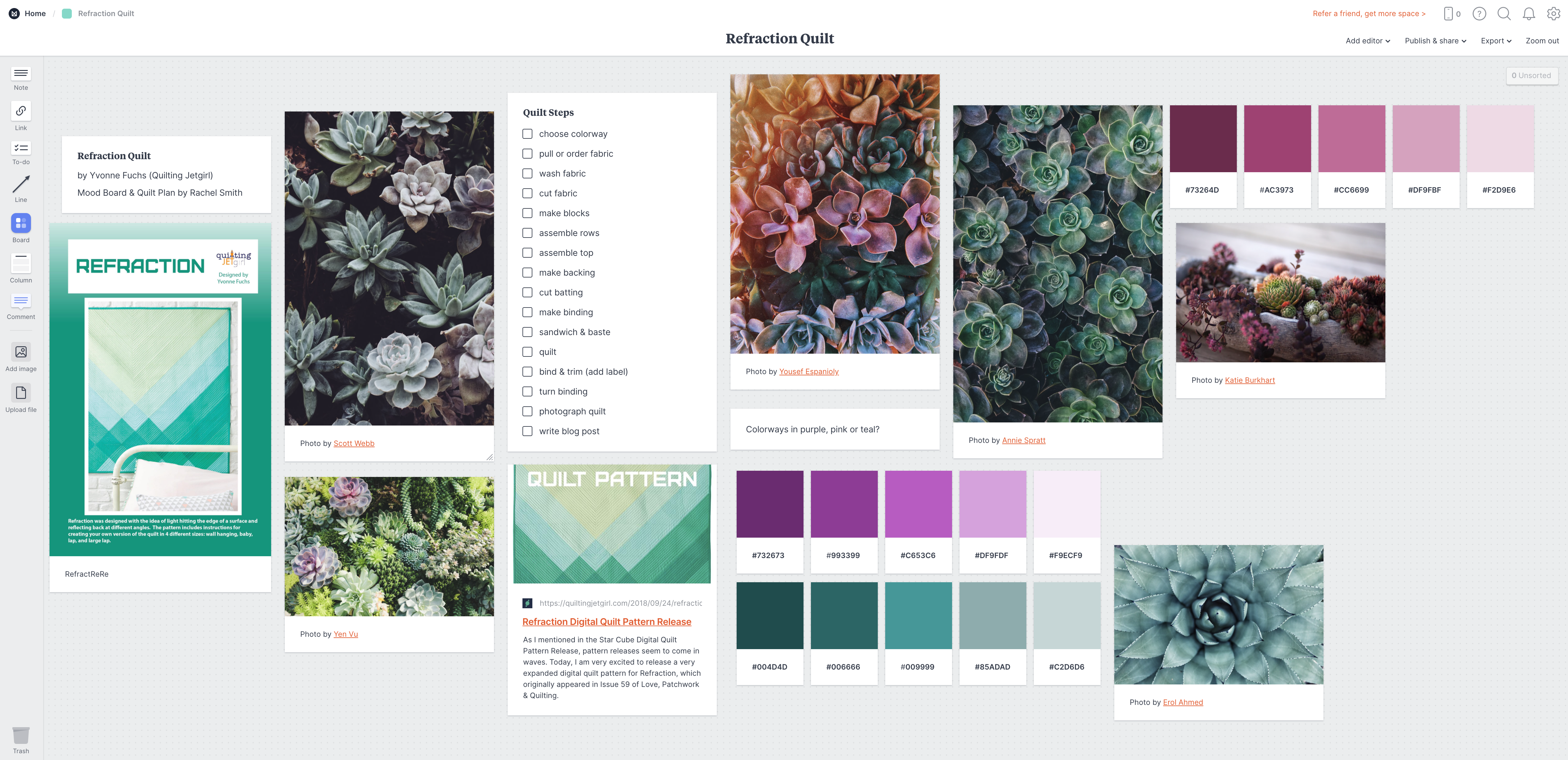
My first mood board in Milanote
Milanote is… I don’t even know how to classify it, it’s so versatile. It can do kanban boards like Trello, and mood boards faster and easier than how I usually do them (uh… in Illustrator… when all you have is a hammer, after all), and checklists and swatches and comments and… there’s a lot there. It has dozens of templates to choose from, for design and software/agile and teaming and planning and even writing. I picked the Mood Board template because I wanted to see how it would work for planning a new quilt that I hope to make. You know, someday.
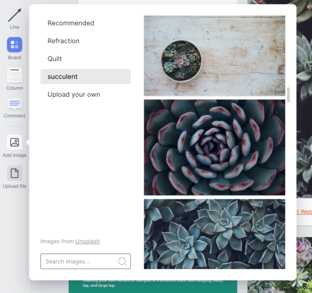
After adding a heading, a picture of the quilt, and a link to my selected pattern (Refraction by Quilting JetGirl/Yvonne Fuchs), I headed over to Unsplash to find mood pictures. I did a bunch of work downloading the pictures and copying the credits into a file, as I usually do, and then I uploaded some of them into Milanote. When I had used all the photo spaces that came with the template, I clicked the “add image” button, and that’s when Milanote blew my mind. It’s already linked up with Unsplash. I typed the same search terms in Milanote, and then just clicked each Unsplash photo to add it, right there on my board. Each one popped in beautifully with the photo credit already attached.
Adding a photo from Unsplash.com in Milanote
After that, I just started writing this review because I had to rave about it. The interface is delightful. It’s pretty and elegant and intuitive, with just enough snap-to help so that your board looks perfect, but not so much that you spend a lot of time nudging stuff and swearing (I’m looking at you, MS Word). The different cards (checklist, photo, swatch, comment, heading…) behave exactly as I expected, except where they were even better than I expected. Software companies always talk about delighting their customers. Milanote, I am delighted.
I didn’t test the collaborative aspects, but there’s a tab to add collaborators (editors) and it looks as easy as you’d expect. You can also add comment cards and use @ mentions to your teammates to ask them questions. You can export the board as a PDF or an image, or you can create a view-only link like this one. Have a look. You can even look at a board on your phone and add a “quick note,” which appears in a special column accessible from a menu icon.
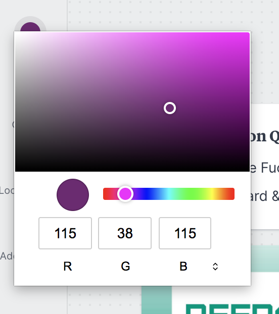
The one drawback I found was the color picker. It’s a very simple one, and I wanted an eyedropper so I could pick colors out of the photos on my board. (If there is one, I didn’t find it.) I ended up flipping back and forth between Milanote and a hex color picker in another tab, which was unsatisfying. I did love being able to paste the hex color into the swatch template and have the color fill the swatch, though.
Milanote’s color picker (there’s also a small swatch palette)
After about 45 minutes (including writing this review) I ended up with the board pictured above. I’m left feeling like there is more to discover, in a good way, and looking forward to creating more boards later on. I’m curious how it would behave with multiple people working on a board at once — something to test another time. For now, I definitely recommend giving it a try for any planning or design project you’ve got coming up.
I admit I’ve been waiting for this app to be released ever since I first saw it demonstrated at EuViz 2014 by its creator, Holger Nils Pohl. I fell in love with the demo and instantly became BFFs with Holger (at least on my side). When the beta version was ready, I happily tested that, although I had to use a colleague’s iPad to do it. Now I’m thrilled to have the WorkVisual app on my own iPad and to have played with it enough to write up a review. (A long one.)
Lest you think that I am regarding this app through rose-tinted glasses, let me say right up front that it isn’t perfect. Read on to find out what I love, what I don’t love, and why despite its rough edges, this app is worth the $40 sticker price to me. But first, a video I created with the app yesterday:
See below for some notes about the video.
WHAT’S WORKVISUAL?
WorkVisual is a drawing app designed by a graphic recorder for graphic recorders. It’s optimized for digital note-taking, sketchnoting, and graphic recording. It isn’t a mind-mapping tool or a drafting tool. It’s designed for people who write and draw everything by hand. For those of us who know and love the original Brushes app, this is the first app that even comes close to reproducing the features and line quality of Brushes. Because it was designed by a graphic recorder, it adds some important features that even Brushes didn’t have.
WHAT I LOVE
In no particular order, these are the features that make me giddy with delight:
Presentation modes: WorkVisual has two modes for projecting the screen, Full and Follow. Set it to Full, and the projector keeps your work at 100%, showing the entire screen no matter how much you pan and zoom on the iPad itself—perfect for digital graphic recording in front of an audience. Set it to Follow, and viewers see what you see—perfect for teaching.
Gallery tags: I create a lot of drawings. WorkVisual has a tagging feature so that I can add the subject, client name, location, event name, or other labels to a drawing. Later, I can search on that tag to pull up all the related drawings.
Four spots for brushes: Access three custom brushes and an eraser with one single tap. This means a lot less fussing around in the brush menu.
Clean interface: The UI is incredibly simple and light. I had actually done two different graphic recordings before I realized that there’s no way to dismiss it. I simply stopped noticing it was there, except that all of my tools were always available.
Transparency lock: I love this, just love it. You lock the transparency of a layer, and then you can color over places you’ve already drawn, but nowhere else. Great for fixing mistakes where you wrote or drew in the wrong color accidentally.
Layer access: Switch to any layer with one tap. I switch layers a LOT and this makes my work so much faster.
Set as default: This hidden feature is super handy. In the Gallery, you can choose a drawing to set as the default, which means that any new drawing will start with that as the base. Great for setting up the titles and basic frames for a series of graphic recordings at an event.
Brush presets: Get your brushes just the way you want them and save a preset. Then, modify them for a custom job and save a different preset. Switch between them with a couple swift taps. Awesome.
And there are the features that are must-haves for graphic recording, for me at least:
Zoom: zoom way in, and double-tap to zoom out instantly. I use this all the time. Because the zoom is a double-tap and not a single one, you can tap-to-dot for punctuation, lettering, and so on.
Layers: Up to six, which is enough for me. They have the standard features of merge, transform, normal & multiply modes, opacity, duplicate, add a photo, clear, fill, and hide.
Undo: Just like the original Brushes, if you undo something, it won’t show up in your movie. Yay!
Export options: From the Gallery, you can mail a drawing as an image, save it to your Photos, or export the image sequence for the WorkVisual Exporter Mac tool (alpha).
Brush options: The brushes are customizable to just the right amount—enough flexibility to be useful without being confusing.
Color palettes: Create up to five swatch palettes of 15 colors each, plus you always have access to a custom color picker.
Eyedropper: Tap and hold anywhere to pick up that color, just like the old Brushes — yay!
WHAT I DON’T LOVE
Of course, there are a few things that aren’t ideal. Some of these might be bugs, and some are purely my preferences. I’ve shared the ones I think are bugs with the app’s creator, who is super and very open to feedback (thanks, Holger!). Again in no particular order:
Double-tap to zoom: This is a plus and a minus. It’s a plus because, as noted above, I can dot my i’s and punctuate properly. But I find that most of the time, the app reads my double tap as a single short stroke. The workflow looks like this: double-tap, double-tap, double-tap, double-tap, zoom, undo, undo, undo. I imagine for someone using a stylus, this would be difficult too.
Current brush shape doesn’t highlight: When editing a brush, it would be nice to know which brush shape was currently selected without having to look down at the brush button.
Brush sizes reset in between choices: If you set up a custom brush and change its pixel size, then use that same button to select a different brush temporarily, when you go back to the first brush it will have reset to the default pixel size. Creating and loading presets doesn’t help. This gets in my way because I have six common brushes and there are only four brush buttons, so I have to change to the other two when I need them. My basic brush keeps resetting from 3 pixels to 30. (Then again, maybe the app is just trying to tell me I write too damn small.)
‘Undo brush’ notification: Every time you tap Undo, which for me is often, a little box pops up to let you know the brush is being undone. I have to wait for it to vanish before continuing. It doesn’t stay up long, but it breaks my flow and I would love to be able to turn it off.
Layer order in Export tool: There’s a bug (I assume) in the exporter tool that reorders layers when you export a high-res image or video. Since I usually create the text & outline layer first, then create the color layer when I need it and drag it underneath the first layer, this means that in the exported video my color is on top of my outline, which looks bad. You can see it in the video if you look closely enough.
WHY IT’S WORTH THE STICKER PRICE
At the time of this posting, WorkVisual sells for a pricey $39.99. I hear you. “For an app?! Are you nuts?” I know, I know. Here’s the thing. I’m a professional digital graphic recorder. This is a professional tool. It’s worth the investment. If your work involves drawing, sketch noting, or graphic recording with the iPad, this is the next tool you want in your toolbox. One job will cover it, you know it will.
When people ask me which app I recommend for graphic recording on the iPad, this is the one I will tell them to get if they are serious about it.
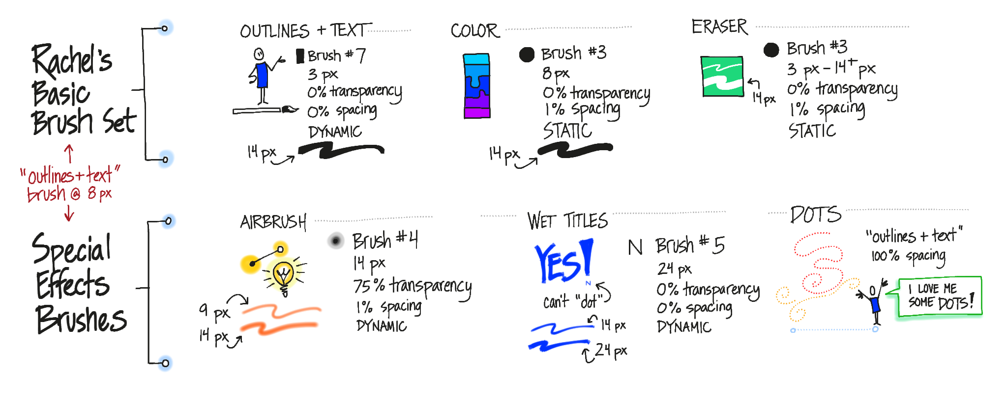
MY BRUSH CHOICES
It’s all explained in the video, but here’s a reference for my initial brush setup (click it for a readable copy):
I think I’ll change the basic brush from 3 pixels to 5 pixels, because there’s a lot more variability in the line at 5 pixels. Plus, it really wouldn’t hurt if I wrote a little bigger. That will probably mean I bump the Color and Eraser brushes up a couple of pixels too.
MY TOOLBAR SETUP
This is how I have my brushes set up, and how I arrange the layers as I create them:
It’s a screen shot right out of the app, and all the lettering was done in WorkVisual. That’s its actual toolbar.
MAKING THE VIDEO
I’ll post a detailed step-by-step in a week or so once I’ve gotten the process smoothed out. For now, the short version is that it is possible but you’ve really gotta want it. Here’s a high-level overview:
Create your drawing. There’s a bug in how the layers are rendered out, so it’s best to set up your layers before you start and don’t drag any layers underneath any others.
In the Gallery, use the Export for Mac Tool command to email the .workvisual file to yourself.
Open the .workvisual file in the WorkVisual Exporter (separate Mac application).
Export it as described in the instructions on the app website.
Use your favorite tool to convert image sequences to video (there is a WORLD of sub-steps hidden in this one). I haven’t successfully rendered a high-res video from the app yet.
Open the video in your favorite video editor, add a voiceover and soundtrack, and render it out. Ta da!
You can see the result above. Couple things to look for in the video:
Since I couldn’t render a high-res one, it’s tiny (540p). If I render it larger (740p or 1080p) the lines are very blurry and look bad.
That, combined with my tiny writing, makes it difficult to read the text.
I made a couple of mistakes and erased them, so you’ll see that happening. Other mistakes I used the ‘undo’ command to get rid of, and you won’t see those.
The layering bug means that everything I color shows up on top of the outlines in the video. It looked right when I was recording it, but because I had reordered the layers, it comes out wrong in the exported video. It’s correct in the final still image of the video, which is a screen shot of the app.
THE BOTTOM LINE
I’ll say it again: When people ask me which app I recommend for graphic recording on the iPad, this is the one I will tell them to get if they are serious about it.
I am thoroughly delighted with the app and ready to start using it as my primary digital note-taking tool. The initial release is a solid, robust app that does what it says it will do, with a clean interface and just enough features for graphic recording. I’m confident that it will continue to evolve and develop.
Because the Export tool is still in alpha, I’m not quite ready to kill Brushes in favor of WorkVisual, but I can see that happening down the road. This is good because my poor iPad is existing in a state of unstable limbo with iOS 7. I can’t upgrade to iOS 8, or I’ll lose Brushes’ ability to export high-res images and video completely. At the moment, Brushes is still the better option for creating video in terms of workflow and output.
With a little more work on the alpha Exporter tool, WorkVisual will soon be the app that I use most out of all the ones on my iPad.
Updated to add a mention of the Eyedropper feature that got left out the first time.
This is definitely a big step in the right direction for making digital graphic recording accessible for more people. With this tool, you can start, host, and graphically record a web meeting in seconds, all from your iPad.
What is it?
Join.Me is a web conferencing tool (think WebEx, GoToMeeting, Adobe Connect, Zoom, and so on — there are lots.). This one has a hip, friendly vibe and is incredibly easy to use whether you’re on a desktop, a laptop, an iPad or other tablet, or a mobile device. Incredibly easy.
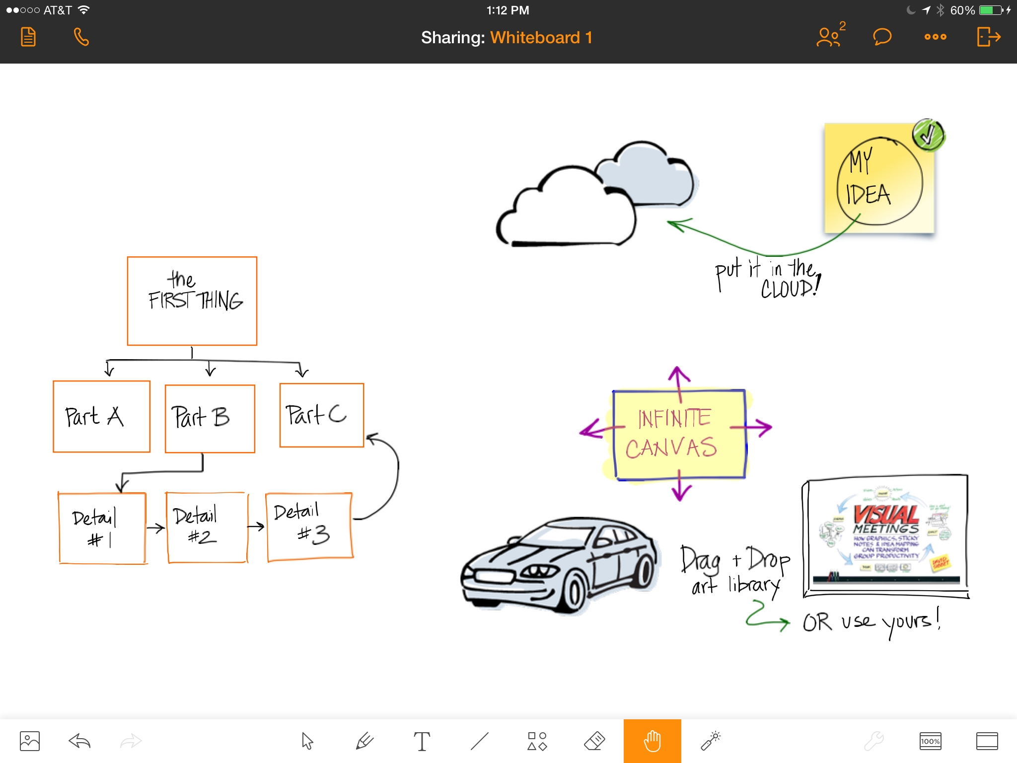
The thing that has catapulted Join.Me from ‘incredibly easy’ to ‘wow, just wow’ for me is its new whiteboard for iPad feature. I tested it today with some willing volunteers (thank you all, you know who you are) and I’m impressed.
With the whiteboard, you can draw, write, create shapes, and import images from Join.Me’s easily-accessible library or from your own photos on the iPad. You can share it while you’re drawing it, so viewers can see your whiteboard. You can share other documents, too, once you get them into Join.Me. You can draw right on the iPad’s screen and everyone can see it whether they are joining the meeting from a desktop, a laptop, an iPad, or a mobile device.
With one tap you can be in an audio conference along with the screen sharing, which means you can start, join, and participate in web meetings on your iPad and share your iPad’s screen. Yes, that means you can now graphically record web meetings on your iPad and have everyone see it. Easily.
What’s it good for?
I can see using this in several ways:
To share concept sketches or other documents with clients, annotating them in real time while we talk, even if I’m sitting in an airport or a hotel room or anywhere else.
To graphically record web meetings and have everyone be able to see it, even if I don’t have my giant Cintiq handy.
To quickly create rough sketches to capture ideas during a meeting.
This is what it looks like on the computer when someone is sharing an iPad whiteboard.
Likes & Wishes
What I like about the whiteboard tool:
Infinite canvas: You can just keep sliding your work to the side and adding more. Viewers can pan and zoom independently of the presenter, too, so they can go back and check details anytime they need to.
Zoom: Totally necessary for any drawing app, in my view. The zoom isn’t as smooth as I would like and it takes a couple tries to zoom out sometimes, but there’s a handy framing button that jumps you back and forth.
Drawings are objects: Everything is treated like an object, which is nice because it can be resized, dragged, removed, recolored, and so on. You can pull a sticky note out of the Join.Me library, write on it, and then move and resize the whole note.
Layers: I also really like layers in my drawing apps. This one has rudimentary layers, allowing you to move objects in front of or behind other objects.
Library: The sketch library provided with the app is nice. I like that you can also bring in your own art — which means you can create your own library of stuff that you use over and over. It’s really easy to drop stuff into the whiteboard from the library, too.
Audio: During testing, I tapped the little phone icon in the top left corner and joined the call from my iPad. The sound quality on my end was great, and my partner in crime told me she could hear me loud & clear too.
The sticky note background, car, clouds, and book cover were pulled in from the image library and my photo roll. The rest was drawn in the whiteboard itself.
What I wish:
It still isn’t a collaborative whiteboard; only one person can work on it at once. If you pass the presenter role to someone else, your whiteboard stays with you, and they have to start a new one or share another document, so in that sense it’s like any other web conference screen share. However, you can email the whiteboard to yourself in JPG, PDF, or (game-changer alert!) native Join.Me format, so someone else can load it into their copy of Join.Me and continue working on it. I’m a big fan of any iPad app that lets you move your content around. BIG fan.
Like any other iPad graphic recording tool, it does slow you down. It just takes longer to navigate around the space, draw and write things. I wouldn’t try to do detailed graphic recording while facilitating a meeting using this tool.
You can’t use the whiteboard from the desktop version of Join.Me, at least not that I can see. You can watch, but you can’t create and share a whiteboard. Since you can create and share your screen using any application you have on your computer, this isn’t a huge deal.
What it looks like on my iPhone (sideways).
Where do I get it?
The app is available on the app store. If you don’t need to run meetings, it’s free. If you want to host meetings, you’ll need to visit Join.Me on the web and get an account. There’s a basic, free one that lets you have up to 10 participants, and there are pro and enterprise levels too.
There’s also a Join.Me desktop application that’s only necessary if the person on the computer wants to present. If they’re just attending, they can do that right in a web browser without downloading anything. (Did I mention easy?)
FiftyThree, makers of the Paper app and the nifty Pencil, have released Think Tools, a new set of tools inside Paper that change what you can do with the app. If you have Paper, just update to get ThinkTools.
The new toolset lets you do rapid mockups, mindmaps, flow charts, and other visual prototypes quickly and (more or less) easily. While I am crazy about the new toolset, I have to admit that Paper and Pencil still frustrate me and there was some definite head-banging-on-chair-back while I was creating this test image. (Disclaimer: for reasons I won’t go into here, I am holding off updating my iPad to iOS 8, so although I am using the latest version of Paper some things might be different for me — and not in a good way.)
After playing with the tutorial and trying some random shapes for a bit, I decided to test it out by recreating a flow chart I made for my bedroom door when my young son had a sleepover with a few friends one winter holiday:
Thinking of waking me up? Check this handy flow chart first.
What I Love:
The quick and easy way you can draw shapes, move them around, and connect them with arrows. The promo video (which mentions visual facilitation, by the way, woo hoo!) shows some very cool examples of prototypes and early designs, and I see this as the key strength of the toolset. You can create and rearrange a diagram while you are in conversation with someone. Very handy, and I can definitely see using it a lot.
What I Like:
The variety of controls in the Think toolset: in addition to the smart pen that makes your shapes look nice and adds arrows automagically, there’s a scissors tool that lets you move things around, delete them, and copy/paste them (yay!). There’s a fill tool that lets you easily fill and clear fill from shapes as well as filling in the whole background. There’s also an eraser that I think is smart although it might just be that I was lucky when I used it, but it seemed to know about the edges of smart shapes at least a little bit.
What I Don’t Like But Can Live With:
The color mixer. It’s a cool idea and if I were painting I’d love it, but for what I do it just gets in my way and occasionally ends up with the wrong color selected so that I have to … Undo, which is another frustrating tool. The two-finger rewind is nice if you need to undo a LOT of stuff at once, but if you want to quickly get rid of the stroke you accidentally made because the app suddenly decided the Pencil was in fact your finger and you wanted to smear everything instead of writing, it’s a pain in the neck. Placing and moving two fingers correctly takes up way too much time and brain space for undo.
What Makes Me Bang My Head Against the Back of My Chair:
Writing. Oh, this is so painful. The zoom (loupe) has gotten a bit better, and now enlarges smartly when you get near the edges, but I consistently have problems with writing. If you write with the Pencil stylus, the app is supposed to understand that when you use Pencil you want to write and when you use your finger, you want to smudge. This would be super cool, again, if I were painting or drawing. But trying to create a flow chart or do notetaking, I find that sometimes the app stubbornly insists the Pencil is my finger and just smears in the middle of a letter (like when I’m writing the cross bar on the ‘T’ for instance). This slows me down so much that I lose the thread of what I’m trying to take notes on, which is a showstopper for me. So I switched Pencil off and just used my finger.
That got rid of the smearing problem, but the zoom is still problematic. There’s no way to re-center the canvas (that I’ve found), so if you want to write near the edges, it’s very difficult. On the top and bottom edge, I kept accidentally calling up the iPad’s pull tabs, which is irritating. I would love to be able to drag the canvas so that whatever I’m trying to write is in the most comfortable position — just down and to the right of center — so that my arm doesn’t get tired from holding my hand up off the screen. (I know, I know, Pencil is supposed to let me rest my hand on the screen. Not so much.)
So, a mixed review. I really love the new functionality of Think Tools. I still adore the little books that make up the interface, and the social-sharing capability is really cool. But I keep getting stuck on the difficulty of actually writing. If you have Paper, try it out yourself and let me know how you find it!
Today everything aligned perfectly — time, equipment, and perseverance — and I was able to test the new Work Visual app by Holger Nils Pohl. I am SO excited! These are some initial notes about my experience.
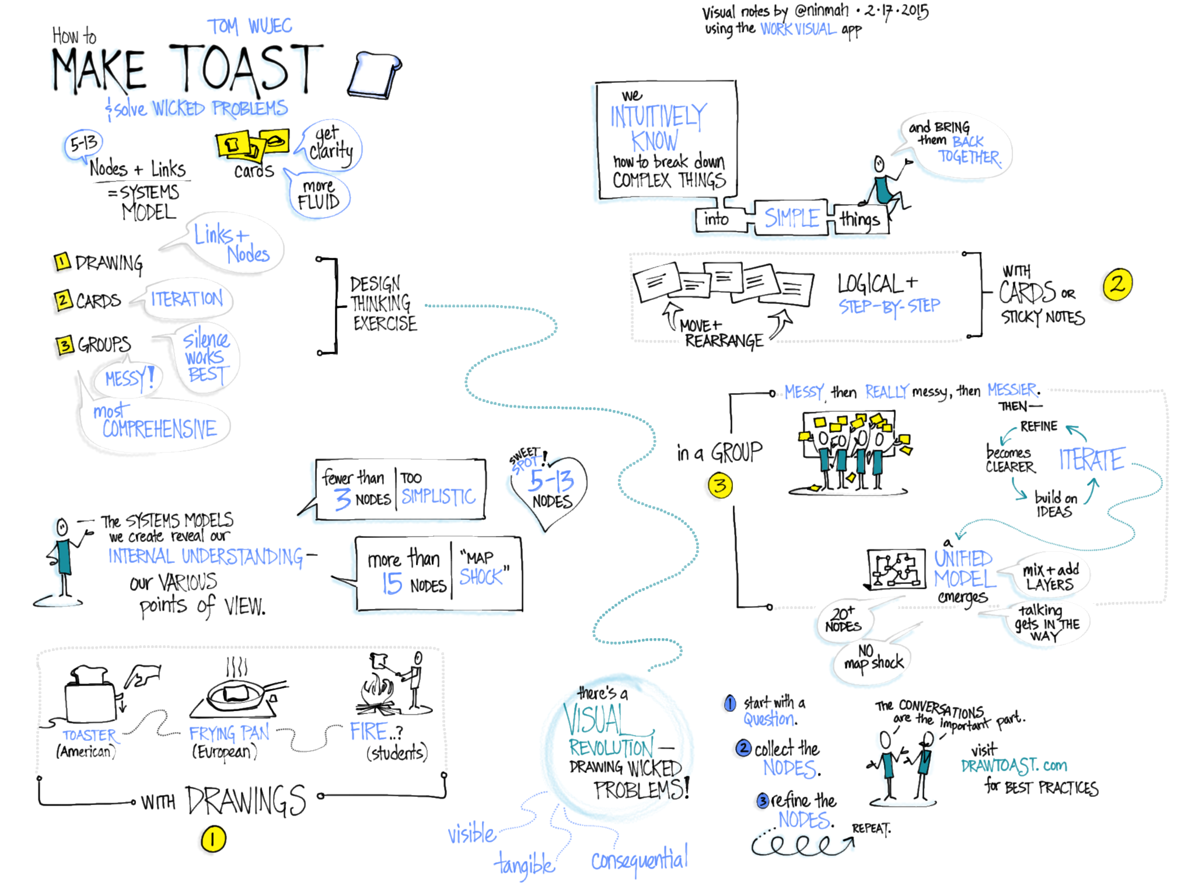
I started by doing random doodles to get a feel for the interface, but of course the only way to really test it was to do some visual note-taking. I had been meaning to watch Tom Wujec’s TED talk on Solving Wicked Problems, so I fired it up and went to town. Disclaimer: I listened to it twice, and made liberal use of the pause button the second time, because the newness of the interface slowed me down a lot. (Know your tools!) Here’s the result, which doesn’t look substantially different from what I might have done with my old favorite, the original Brushes app. Click to see it larger:
Visual notes of Tom Wujec’s TED talk, Wicked Problems, made during a trial of the beta version of the Work Visual app.
LOVE IT: What I already adore about the app!
I love the clean interface and the ease of switching layers and brushes.
I love that I can customize four brushes and they are right on the toolbar.
I love the zoom in (but not the zoom out, see below).
I love the line quality, which for me is one of the most critical components. Nailed it!
WISHES: What I would wish to see in future versions.
Double-tap to zoom out. If there is a quick way to zoom back to full screen, I never found it. This is what gave me the most trouble during my practice run.
I don’t know if it was the iPad I was using (I had to borrow one*), but the panning kept sticking while I was zoomed in. I’d start dragging with two fingers, and sometimes nothing would happen. This slowed me down a lot too.
There’s a strange thing that happens when one line crosses another, like when I’m lettering. At first I was disturbed by it, but then I realized that it wasn’t permanent and I was able to ignore it. What happens is that the color gets shifted around the crossed lines (on the left), but once you zoom or pan, it goes back to normal (on the right).
(Left) Color shifting when lines cross; (right) back to normal after zooming.
I wasn’t able to test the projection capabilities today, but I am super excited about them because it means you can FINALLY do graphic recording on the iPad while hooked up to a projector and not have to distribute airsickness bags to the audience beforehand. You can set it to only show the full screen, no matter how much you’re zooming and panning. Hurray! I also couldn’t test the video export but I hope to be able to once it’s ready.
I am so looking forward to the release of this app! Want to follow along while Holger develops it?
* Why I couldn’t use my own iPad: I’m still using the original Brushes app to create videos. Unfortunately, the export features of the original Brushes don’t work with the newest iOS. Also unfortunately (for me), TestFlight, which you need in order to test Work Visual, doesn’t work with older versions of iOS. So Brushes and the Work Visual beta cannot coexist on my iPad.
My colleague and friend Lisa Arora of Get the Picture recently published two digital books about important topics in graphic recording — how to really make the most of the dance between a facilitator and a graphic recorder, and how to conduct gallery walks of completed charts — and they are outstanding.
How To Get the Most Out of Working with a Graphic Recorder is an excellent resource for facilitators and graphic recorders (GRs) about how to work together. The suggestions and explanations are clear and insightful, and if you implement them I guarantee they will make your very next tandem engagement better. I highly recommend it for anyone running a meeting or workshop who plans to work with a GR, even if you don’t think of yourself as a facilitator. If you’re wondering whether you want to hire a graphic recorder and have never engaged one before, read this book to understand how to work with one so that you reap the real value of working visually. If you tend to work solo (doing both the facilitation and recording yourself), you might pick up a few tips, but the book is really aimed at facilitator-graphic recorder partners, and for those who plan to engage one or the other.
The other book, The How To on Effective Gallery Walks for Visual Meetings, is comprehensive, creative, and brilliant. It really gets into gallery walks (where participants spend reflective time looking at the maps at different points in the meeting, and thinking deeply about them). It goes way beyond grouping people up and having them file past the charts. If you want to extend the life of the maps, maximize their usefulness to participants, and deepen the level of thinking in the group, get this book, read it, and build a real gallery walk into your next visual meeting. I’ll be pulling ideas out of this one starting immediately, I can tell you.
Go take a look at the two books. If you partner or hire facilitator/GR partners, get them both. If you are a graphic recorder, a facilitator, or a dual-role graphic facilitator, or if you plan, host, or sponsor visual meetings, get the one on gallery walks. You’ll be glad you did.