Author Archives: ninmah

Registration Open: Free Creative Lettering Webinar on August 23

Media_httpnewsgroveco_jisus

Registration is open for the one-hour online seminar on creative lettering I’ll be leading for The Grove on August 23. Check the article for the registration link and instructions. See you there!

Save the date for a free online creative lettering seminar!

Lettering

More to come soon, but for now, I’ll be teaching a free, one-hour creative lettering seminar for The Grove. It’s scheduled for Tuesday, August 23 at 11:00 am Pacific Time. We’ll meet online, so no travel required! I’ll demo two lettering styles and show how they can be adapted for use in all kinds of formats — graphic notetaking, large-scale graphic recording, and digital graphic recording. Keep an eye peeled for registration information!

Tools for Virtual Meetings

I get asked a lot about the tools I use to graphically record virtual meetings. ‘Virtual meetings’ in this case means web conferencing sessions, where people are connected from all over the place using computers and some kind of software like WebEx, Connect, GoToMeeting, LiveMeeting, Elluminate, and so forth. The web conferencing software has to either support screen sharing or have a really, really good whiteboard feature. A previous post talks a little bit about my setup, but here’s a little more about why I choose the tools that I do. As always, YMMV.

The Short Answer

Mostly, I use the Wacom Cintiq tablet with WebEx meetings. The Cintiq is an LCD tablet that works like a second monitor you can write on with a special pen or stylus. I use Sketchbook Pro as the software, because it’s very responsive and it has all the basic features I need for digital graphic recording. I attach the Cintiq to my laptop, set up the monitors so they are not mirrored, log in to WebEx, and share the Cintiq screen.

The Longer Answer: Hardware

Wacom Cintiq Tablet (or similar)

Pros: Very easy to write on; best option for web conferencing.

Cons: Expensive; not very portable; can be tricky to hook up and calibrate.
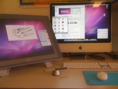
Cintiq

The 21UX. Oooh. Aaaah. Photo by David Roessli. Creative Commons.

The Cintiq comes in two sizes (12WX and 21UX). Currently, I use the 12WX, but I’m trying to get hold of a 21UX. With the 12WX, once all my palettes, brushes, colors, and so on are open, a lot of the canvas is covered. What I do to get around this is set up the Cintiq as a second monitor (instead of mirroring my displays) and I put all the palettes on my regular computer monitor, and just put the canvas on the Cintiq. Then I share the Cintiq (you can choose which monitor you’ll share). I have more canvas space to write on, and the palettes aren’t in the way and distracting the watchers.

The downside is that I have to put down the stylus, pick up the mouse, and mouse over to the other monitor when I want to change brushes or colors. This takes a little practice, but it’s not too bad once you get used to it. The 21UX has enough screen real estate that I could put the palettes right on that screen and not have a problem. Unfortunately, the 21UX is very hard to obtain because it’s always out of stock.

Wacom Bamboo Tablet (or similar)

Pros: Not very expensive; portable; very easy to connect to the computer.

Cons: Difficult to do detail work; you write in one place and watch it happen somewhere else.
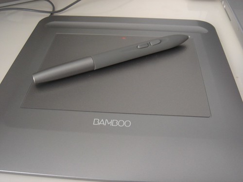
Wacom Bamboo One

The Wacom Bamboo. Sleek, isn’t it? Photo by JeanbaptisteM. Creative Commons.

The Cintiq is my first preference. It’s expensive, though. There’s a cheaper alternative, which is a tablet that doesn’t have an LCD display, like the Wacom Bamboo (you can get the smallest one for $99). This tablet is much more portable and much more affordable, and also easier to hook up (just one cable as opposed to several).

The downside is that it’s much more difficult to do graphic recording using this kind of tablet. The surface is very slippery, making the pen hard to control — though you can work around this by placing a sheet of paper over the tablet — but the really difficult part is that you’re drawing in one place (the tablet) while you look in another (the computer screen). Even after a lot of practice, I still find it frustrating to try to record with it in real time. I think it’s because I like to do a lot of detail work, and it’s really not good for that.

Apple iPad (or similar)

Pros: Really really portable; easy to record on; lots of low-cost options for drawing tools.

Cons: Can’t really be used in web conference settings. Yet.
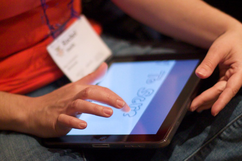
Me, graphic recording on the iPad. Photo by Alan Levine. Creative Commons.

The other question I get quite often is whether the iPad can be used for graphic recording in web conferences. The answer is mostly no, with a tiny little bit of yes. Obviously, you can do graphic recording on the iPad, and I do a lot of it and I love it. However, you can’t really use it for web-based virtual meetings, because there is no way (no reliable way, that is) to broadcast what you’re doing on the iPad to the people in the meeting. The web conferencing iPad apps that exist don’t let you draw on the whiteboard or share your screen (none that I know of allow this, anyway), and you can’t use the iPad to control your computer like you can with the Cintiq.

Well, this is not strictly 100% true, and that’s where the tiny bit of yes comes in. There are a couple of apps for the iPad that sort of let you either broadcast what you’re drawing (Air Sketch) or use the iPad like a tablet/monitor (Air Display), but they are not fast enough or reliable enough to support real-time meetings yet.

I’m still using my first-generation iPad, by the way. Works great.

Software

I use Autodesk Sketchbook Pro for digital graphic recording on the computer. It’s got the basic set of tools I need (layers, customizable brushes, color palettes), it’s relatively inexpensive, and it’s responsive enough to make real-time graphic recording possible.

On the iPad, I still use either Sketchbook Pro or Brushes, although there are a number of other apps that work equally well. The trick is to pick one that feels right and practice with it until the tools are second nature.


Should you work for free?

Jessica Hische has created a handy (and beautiful) chart to help you figure out whether you should take that attractive pro-bono request:

Workforfree

The original is in CSS and HTML, so it can be translated by Google. Wow. Totally cool. Go look at it there.

Project Map

Media_httpfarm7static_dvecq

This drawing came about as I listened to Dave Gray describing a game that someone came up with in a Gamestorming workshop. The image was so vivid that I just had to capture it in a sketch.

The idea is to create a “weather map” for an online project status meeting. Each project would have the shape of a state or country placed on an imaginary map. Prior to the meeting, each project leader would log in and do two things:

1. Place an avatar of him/herself on a stress meter to indicate his/her current level of stress; and

2. Place a weather icon onto the region representing his/her project, to indicate the current feeling about how it is going.

When everyone arrives in the online meeting, they can see at a glance who is the most pressured, and that person can report out first. Neat, isn’t it?

I don’t know who originally proposed the idea to Dave, but I just love it.

chart critique

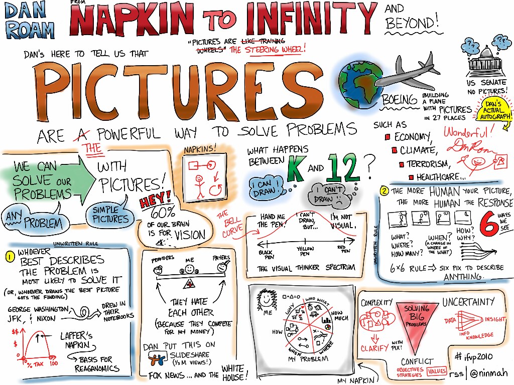
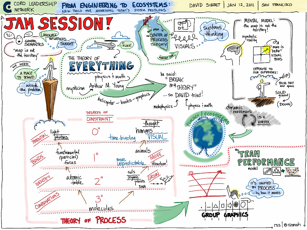
Looking for a way to track your progress as a graphic recorder and find out what areas to focus on for development? Try a chart critique. I recently printed out small copies of charts that I’ve recorded over the past six months — I picked one or two per month — and sat down with my colleague Laurie Durnell to go over them. We looked at how my style has been evolving, identified areas that are working well, and came up with a list of things to practice going forward.

I’d share the charts here, but unfortunately they are confidential to the clients I created them for. (The examples in this post were pulled from my iPad work on Flickr.) I can share some of the things I’d like to work on, though:

  • Changing the length of the paper to help avoid blank space or crowding. I have been using 4′ x 8′ sheets, but I’m going to try 4′ x 6′ sheets, allowing one sheet per half hour, so that I can work on filling the space without crowding.
  • Using different bullet styles (I tend to use all dots or all squares, varying only size and/or color) to indicate different levels or different lists.
  • Differentiating the subtitles of the charts so they stand out more.
  • Experimenting with really big circles!
  • Creating a visual landscape on the charts — I don’t tend to do that unless I’ve planned it in advance. I aspire to being able to create this on the fly!
  • Clarifying the visual flow of charts that aren’t straight-up lists.

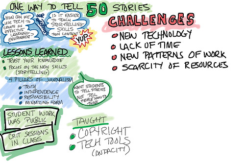
One Way to Tell 50 Stories

(too much white space)

I find that I can pick one thing and practice it during a gig. For instance, if I have a two-day gig, I’ll pick “bullets” and then work on that with each chart I create during the meeting. Some things are best practiced in advance in my notebook; I don’t want my clients’ charts to look like practice work! But some things can be safely worked on during a real meeting, and that’s really how new skills get integrated into my practice.

(fun, but a little hard to follow)

It can be a little scary to invite someone to “critique” your work, but it can also be extremely helpful. Laurie was wonderful; she pointed out what was working, and her suggestions were both constructive and gentle. We noticed that having the charts be very small (printed on letter-sized paper) was an advantage because we could get a sense of the whole chart without being drawn into the content.

(ran out of room, though you can’t tell unless you were there)

Would you be interested in participating in a gentle group critique, or in a session on how to critique effectively? Would you be able to share your charts for such a purpose? What about paired critiques? Let me know — if there’s enough interest, I could do an online session about it.

A Better Icebreaker (via johnleskodotbiz)

Media_httpjohnleskodo_wdlqq

Not digital, but a great icebreaker idea from John Lesko: do it with cartoons!

7 Tips for Great Graphic Recording from Maga Design Group

Media_httpwwwmagamaps_hhcei

The amazing Jim Nuttle spoke at Maga Design Group earlier this month, taking their graphic recorders and designers through a GR session. This post summarizes the tips that Maga took away from the session. It’s a great list for those just setting out on their graphic recording adventure, and also a useful review for those of us who’ve been doing it for a while.

Video of iPad Notes, Virtual Working Summit

The video of the quick notes I sketched on the iPad from the recording of the interview with me and David Sibbet is out. Have a peek!

The interview airs today/tomorrow, depending where you are (23rd June). Update: Let’s try this again. Sorry to all you night owls who couldn’t follow the link. Someday I will tell you why YouTube on iPad is a PITA:

Best in the West 2011

Media_httpwwwbaodnorg_siaxc

The Bay Area Organizational Development Network (BAodn) is presenting Best in the West 2011 on June 24-25 in San Francisco. If you’re in the area and into organizational development or facilitation, take a look at the program — lots of great speakers, including David Sibbet, Michael Broom, Bev Scott, and others.