Last week I invited visual practitioners to send me samples of their work, and I got such an amazing response that it took a couple of extra days to prepare the post about it. (Plus I have been locked in an epic battle with Posterous to get it to look the way I wanted.) Here it is!
I requested images representing each practitioner’s individual creative style, and as you’ll see, the range is very extensive even in this comparatively small sampling of work. I also asked folks to tell me why they picked the particular image they did. Let’s take a little tour of the beautiful pieces that were so generously shared. The list is alphabetical by the last name of the practitioner.
If you’re interested in contacting any of these folks about potential work, please follow up with them on the website listed with their name.
Claire Bronson
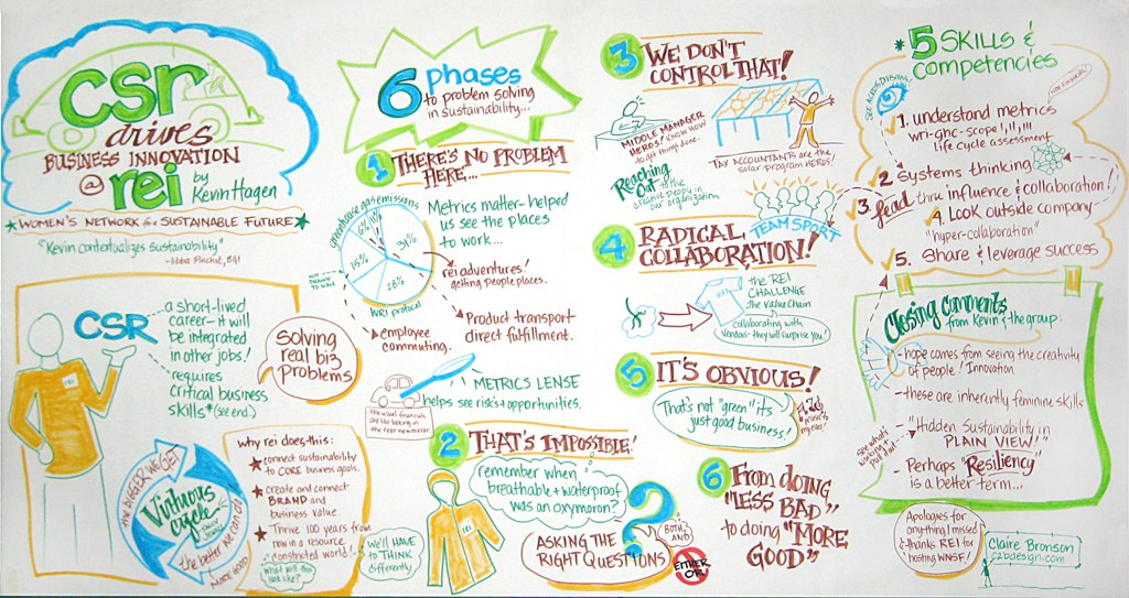
CSR Drives Business Innovation (large-scale recording on paper)
Claire chose this image because, in her words, “the content is near and dear to my heart.” Her chart records a talk by Kevin Hagen about sustainable business practices at REI, given for the Women’s Network for a Sustainable Future. I love the springtime colors she chose and the fun, funky lettering of the subtitles in this piece.
Michael Erickson
(Photo no longer available)![]()
This complex and detailed chart illustrates real-life examples of systems thinking. Michael uses visual metaphors to describe and explain concepts in large-scale “learning maps.” Learn more about Michael’s work on his website.
Jonny Goldstein
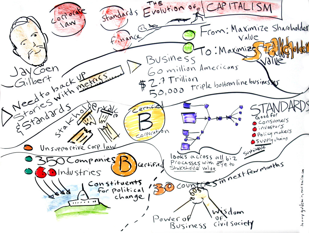
Jay Coen Gilbert (large-scale recording on foamboard)
This is a graphic recording of a talk at TEDxPhilly on the topic of B-Corporations. Jonny notes, “I picked this example because I love doing graphic recording for people with world changing ideas. The speaker, Jay Coen Gilbert, has one of these world changing ideas. He has created a movement to create a new legal corporate entity, the B-Corporation, which is accountable to a broad range of stakeholders, beyond investors, to include suppliers, the local community, employees, and even the environment. This movement has the potential to radically change the ways that corporations shape our society and our planet.”
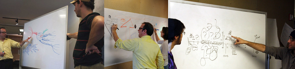
(photos from visual problem solving workshop)
Jonny teaches a visual problem solving workshop to masters-level students in the Industrial Design program at the University of Arts in Philadelphia. He gives the students tools they can use with their industry partners to develop and manage complex projects. (Jonny’s the one in the yellow shirt in the photos.)
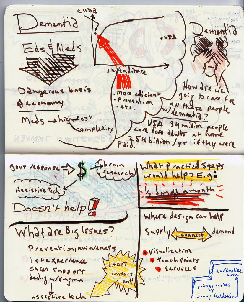
Sketchnotes (small-scale recording on paper)
In Jonny’s words, “Here is a sketchbook image from some notes I took at a talk by futurist and design thinker John Thackara. He talked about the contributions designers can have in addressing the massive and complex problem of how society handles caring for a tidal wave of seniors with dementia. Like Jay Coen Gilbert, John Thackara has world changing ideas that address big, gnarly, challenges.”
I really enjoy Jonny’s free and easy style and his beautiful line quality. It makes his work look like it’s breathing.
Jeannel King, Big Picture Solutions
Over Worked, Overwhelmed… and Over It! (large-scale recording on paper)
This graphic recording was of a 60-minute keynote presented inspirational catalyst and the founder of Madly In Love With Me Day, Christina Arylo. It measures 4′ x 8′, and was created on 20# Bond paper with a combination of Sharpie flip chart markers, Tombow dual-point brush pens, and some Copics thrown in for good measure.
Sketchnotes (small-scale recording on paper)
These visual notes are of a 30-minute keynote presented by Olympic gold medalist, Ruben Gonzalez. They were taken on a Canson Manga sketchpad with a Prismacolor chiselpoint pen and Tombow dual-point brush pens for the color.
Jeannel says:
“These are both really representative of my style, philosophy, and work: it’s fun, it’s colorful, it’s joyful/playful, it’s darn effective, and I typically work with clients who either are sharing inspiring messages, or are inspiring groups (others or themselves) to realize their fullest potential. Neither of these were planned in advance (I never plan pieces in advance), and yet they both worked out exactly right…and that speaks to my belief that it all works out the way it needs to! (While there were other pieces that represented how groups work through problems, etc., at the end of the day I chose these two because they make me happy to look at!)
“When I work, my process is really a zen practice: I check my Self at the door and remain absolutely present to what’s in the room. In a way, it’s a bit like channeling the room’s experience onto the page. I am so grateful to get to work with people who are passionate about their projects, helping people do what they love…by doing what I love!”
I have to agree that Jeannel’s work is very joyful, but then so is Jeannel!
Rebecca Lazenby, Paragrafix
(Photo no longer available)
I love the clean, crisp look of Rebecca’s work. This recording is a 2m x 1m chart on on paper, using Neuland markers. Rebecca photographed it with a panasonic Lumix, which she likes because of its wide lens, and cleaned it up using Whiteboard photo and good old paint. The client name has been removed for confidentiality.
Rebecca says:
“I chose this image because it was one of the first I did where I really was able to let go creatively whilst being so tuned into the material. I think it shows in the flow and I also had a lot of positive feedback about colour that day, so since then have been able to make more conscious choices about colour. This was the first chart I did where the client said they would use the image as ‘visual minutes’ — it’s easy to read back to people back in the office and that is very important to me in my practice. I try to encourage people to use the charts afterwards to share what they have done on the day.”
Irene Nelson, Irene Nelson Design
Business Communication in the Global Marketplace (large-scale recording on paper)
Like many visual practitioners, Irene notes that much of her work is proprietary or confidential to the client. This is one that she is free to share. It measures 8′ x 4′. I love her bright, bold color choices.
She says, “I believe this image conveys strong listening skills and my ability to organize information quickly. The 25 years of extensive and varied design expertise I have as a graphic designer is clearly an asset to my work in graphic recording. I had a lot of fun doing this. The energy in the room was contagious!”
Alexandra M. Pickett
SLN Online Course Models (digital illustration)
In Alexandra’s words, “This is a process illustration that helped me to articulate and define SLN online course design models. It is a digital illustration that I created in Photoshop.” Alexandra packed a huge amount of detail into this piece! She was an intern at Graphic Guides (The Grove’s forerunner) in the late 1980s and says that David Sibbet continues to inspire her and her work.
Emily Shepard
Storytelling & Ancient Greek Vases (large-scale recording on paper)
I was present when Emily made this epic recording, and I am still amazed and in awe of her ability to craft a unified work of art on the fly as she did. It’s an 8′ x 4′ recording of a talk given by Diane Cline at the IFVP Conference in Chicago in 2008. In Emily’s words:
“I chose this chart because I remember feeling ‘in the zone’ when I made it! I often think about how to contain the different chunks of information when I am recording, and in this case, as I set up my paper, and got ready, I realized I had an opportunity to create the perfect container for this talk – a large greek vessel! It is not often that I’ll draw a large image in advance when I am charting a speaker. I certainly do this when I am working with a faciitator, and we have designed a template to relate to a group process. But with a speaker, it can be a bigger risk, since I am not sure where they will go in their presentation. In this case, I feel that it worked out. I asked Diane for an image from one of her slides, which I used to make the central figure in the ‘porthole,’ and then the other information seemed to sort itself out across the chart. I was pleased when she talked about the roots of Greek innovation and society, and I had the bottom of the chart open – this seemed like a good place to put this foundational information. As usual, a good speaker makes my job much easier. Diane’s talk was well organized and clear, and hopefully that comes across in my chart.”
Martine Vanremoortele, Visual Harvesting

(large-scale recording on paper, English)

(large-scale recording on paper, Dutch)
Martine says she chose both pieces because of the theme: creativity and the power of the impossible. She feels that her best work is yet to come (I hope that’s true for all of us!)

(small-scale recording on paper)
These notes of a talk by Randi Zuckerberg was signed by the speaker! Martine reports that these were taken while sitting in the audience, in a position that was not exactly conducive to visual notetaking. She also notes that Randi was dressed in the same colors as the Facebook logo! I love the little details in her work.
You can browse more of Martine’s lovely and detailed visual work on Flickr.
Nitya Wakhlu, Nitya Wakhlu Innovations LLC
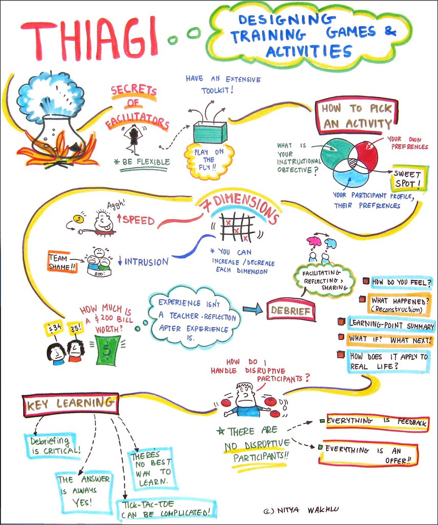
Designing Training Games and Activities (medium-scale recording on paper)
Nitya notes, “This is a live graphic recording of Thiagi’s session from the ASTD Cascadia conference in 2010. Wall space was limited and I had to move very quickly between sessions – which is why I’ve used flip chart sized paper for the capture. I love this capture because it had 2 big AHAs
for me: (1) The secret juice of facilitators is an extensive toolkit and an ability to be flexible (2)There are no disruptive participants – only feedback!”
Education: Current State (digital graphic recording)
Nitya created this image digitally using a tablet and Adobe Illustrator. It stems from a visioning session by Oregon state leaders around education reform. Nitya referred to her live visual recordings from the session to create consolidated concept pieces like this one afterwards; they were then used in a document outlining the new vision that was shared with state legislators.
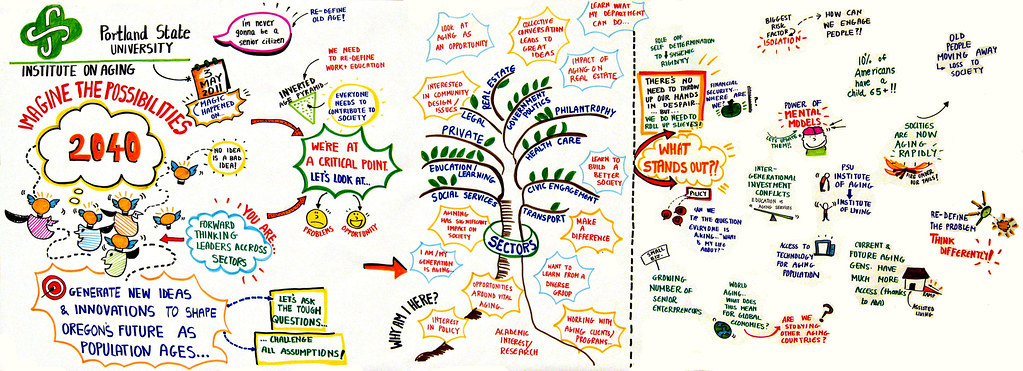
Oregon State Leaders Summit (large-scale recording on paper)
This recording from the Aging Matters Summit in Portland was a very quick capture from a discussion of state leaders. Nitya’s work is bold and clean, and I love her consistent use of color. Her happy little striped people always make me smile.
You can browse more of Nitya’s visual work on Flickr.
Did I miss yours?
If you sent me something and it’s not here, I probably didn’t see the email. Please send it again and I’ll put it in a follow-up post!
Thank you to everyone who took the time to send in something — it’s all about you!
Like this:
Like Loading...